Chosen Theme Word : Attached
After reviewing the 12 options, I have decided to explore the theme "Attached", as I believe there is much room for me to experiment and explore different ideas connected to the word "attached", whether conceptually or literally.
Brain storm on strands ;
- Using strings or some material to act as an attachment. The strings could be connected to someones heart and objects they are emotionally attached to i.e makeup, food etc. Note : The strings don't have to be in a straight line, they could be twisted etc
- I could use coloured pegs as a form of makeup etc so like red pegs for lipstick, blue pegs for eye liner. Then there could be this gif transition video where it goes from the persons natural face to the face with pegs i.e the attachments.

|
Exhibitions
The Hyman Collection - Centre for British Photography
Richard Billingham - Rays a Laugh
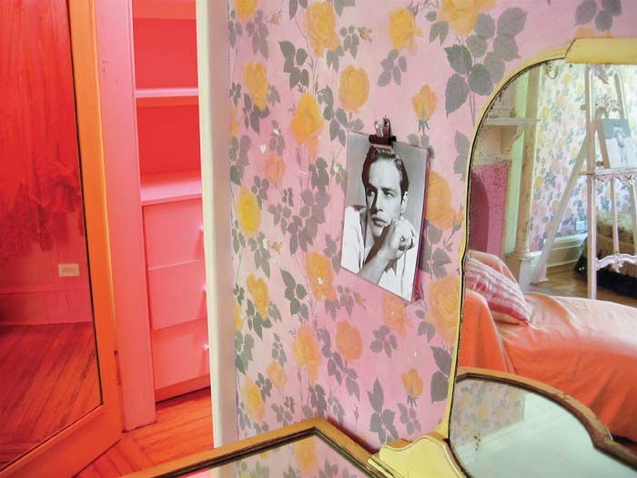
Ray Billingham is an English photographer, who's most celebrated body of work is "Rays a laugh". This series, depicts his family and is also a portrayal of the poverty and deprivation in which Billingham grew up in. The focus of the series is Ray, his father, Liz, his mother and Billingham's younger brother, Jason. Through his photographs, Billingham wants the viewer to consider the complex social and psychological dynamics that underlie poverty, as well as the ways in which these factors can shape family relationships and individual lives. Whilst Bellingham, focused more centrally on Ray, I wanted to showcase the photographs Bellingham took of Liz. Entitled Untitled (NRAL 2) (1994) which is the first picture, is Bellingham's most popular image in the series, showing his mother on the sofa with peaks of their surrounding environment.

|

|

|
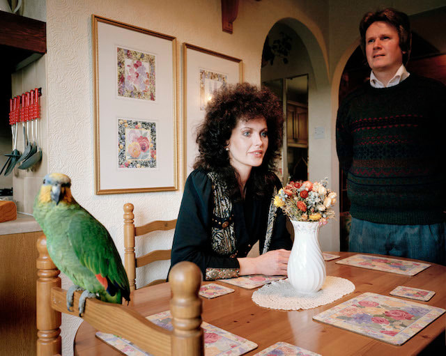
Karen Knorr- Belgravia
Karen Knorr is an American photographer who takes objective images which can be seen in her "Belgravia" series. In this series, the images and texts describe class and power amongst the international and wealthy during the beginning of Thatcherism in London during 1979. Knorr's parents actually lived in Belgravia and the first image of the series is a photograph of her mother and grandmother in the front room of their “maisonette” on Lowndes Square. Although these are isolated images, the photographs are not about individuals but about a group of people and their ideas during a particular time in history. Knorr explained how the meaning of the work can be found in the space between image and text: neither text nor image illustrate each other, but create a “third meaning” to be completed by the viewer. The text slows down the viewing process as we study the text and return to re-evaluate the image in light of what we have read. In addition there are key words capitalised and words from conversations are broken up and laid out on the surface of the photographic paper emphasising its constructed and ironic nature.
I liked how these images show so much personality ! In fact the models worked with Knorr in regards to their outfits, poses etc so it was like they were performing the reality of their lives, and even in the first image, simple things such as the way the women is sitting down on the couch in a more relaxed way, she's just relaxing with her dog and they she has just a dry humoured joke to accompany are perception of her. Perhaps she has a more satirical personality.
I liked how these images show so much personality ! In fact the models worked with Knorr in regards to their outfits, poses etc so it was like they were performing the reality of their lives, and even in the first image, simple things such as the way the women is sitting down on the couch in a more relaxed way, she's just relaxing with her dog and they she has just a dry humoured joke to accompany are perception of her. Perhaps she has a more satirical personality.

|

|

|
8 stories - British Library
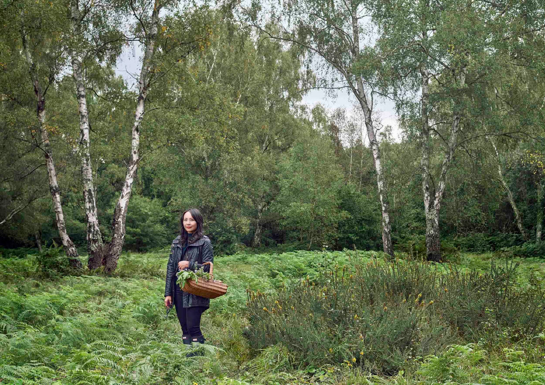
Lau was born in London and grew up in rural Bedfordshire with no extended Chinese community around him. Whilst the UK’s Chinese community is mostly based in towns and cities, in this series Lau introduces us to seven other Chinese and British individuals and what they love about countryside life. Lau wanted to include UK stories that were birthed away from the metropolitan life as opposed to cities and towns where Chinese communities are mainly concentrated, so she's seeking to capture individuals of Chinese heritage who, like herself, have their personality, perspective etc made up of more than one culture.
|
|
Strand 1 - Strings and people
My intentions are to have strings attached on one end to someone's heart, and on the other end to an enlarged object like a lipstick or a phone. The message behind it, is to show what different people are emotionally attached to whether good or bad, they may use these different mediums as a distraction, a way to fill a void, an escape etc.
Inspiration -
I drew inspiration from both of the pictures below (sourced from Pinterest) in terms of the strings and how connected the object was to the persons face in the first picture, and the fact that the cable is wrapped wrought the persons head. It’s quite interesting as it looks like the person is blinded and or their view is obscured by the phone.
I drew inspiration from both of the pictures below (sourced from Pinterest) in terms of the strings and how connected the object was to the persons face in the first picture, and the fact that the cable is wrapped wrought the persons head. It’s quite interesting as it looks like the person is blinded and or their view is obscured by the phone.

|

|
Mitsuko Nagone
Mitsuko Naogone, a Japanese photographer, creates surreal, connotative images by using different objects such as pots, hair, flowers etc to cover the her face in order to explore the title "I am more than my face". Through her work, she wants us to consider the meaning of "Identity" and what actually makes up one's identity. Nagone argues, that ones identity is beyond what someone's face looks like, which is often the basis of which someone judges and stereotypes a person on, hence her face is covered in all of the images. But she also believes identity must be created rather than found and elements such as behaviour and daily routine is what really comprises identity, which is why Nagone used everyday items in her pictures such as a broom stick, or even set ups like a living room and cinema glasses perhaps showing how movies could be integrated into ones identity.
Whilst I don't agree with Nagone's philosophy, it was interesting to see how she played with the colour palette in each photograph. The cohesion of the different shades, made the photograph come together and could even give hints to the personality she wanted to portray in each photograph, which she may have done to support her point further. In addition, the fact that she doesn't show her face pushes the viewer to look at the objects not just obscuring her face, but the objects in her hand as well. From this, the viewer is prompted not judge her based on what she naturally looks like but rather what she is presenting to us.

|

|

|
Set up :
I actually decided to use cables instead of strings and I like the effect it had as I used 3 cables together so it was quite bulky and thick as opposed to strings. This also meant that it would look like the cabled we’re the pulling force between the person and the objects, as opposed to the person just being attached to the object which strings may not have been able to convey as well.
In setting up, I tied three cable charges together ,with a hairband, by the input end. Then depending on the model, I had them attach the input end to their waist (via their lanyard) and or just putting it into the t-shirt layer etc. Then I layed the cables vertically along their chest, so they could zip up their jacket/hoodies fully, meaning the cables would look like they’re coming out of them, more specially their heart.
I then wrapped the end of the cables around and along the different objects, and had assistance to pull the cables towards the objects, whilst my model would pull the cables towards them. I did this, so that there would be actual resistance for the model to pull the cables towards herself, hence it would look more realistic as it showed in their body language and facial expressions.

|

|


Contact Sheet :


For objects I used books, makeup and technology.
To edit, I made my image all black using a noir tint however I stripped the pigment back so that the colour in the books, makeup etc would show up ever so slightly. I think the tint added to the image but also it could show that their connectivity / attachment to these things is what brings them happiness, zeal and colour to their life etc
To edit, I made my image all black using a noir tint however I stripped the pigment back so that the colour in the books, makeup etc would show up ever so slightly. I think the tint added to the image but also it could show that their connectivity / attachment to these things is what brings them happiness, zeal and colour to their life etc
Best Edits

|

|

|

|

|
Overall, I am pleased with the way I wrapped the cables around the model and the facial expressions I captured like in image 2, because it shows this almost tug and pull between the model and the object, she is trying to hold onto it due to her "emotional attachment". I also like how I used many thick cord as it shows perhaps the strength of the attachment. In the future however, I would have liked to see these objects on a larger scale thus being bigger than the models. This could have really emphasised on the strength of that attatchement.
Strand 2 -
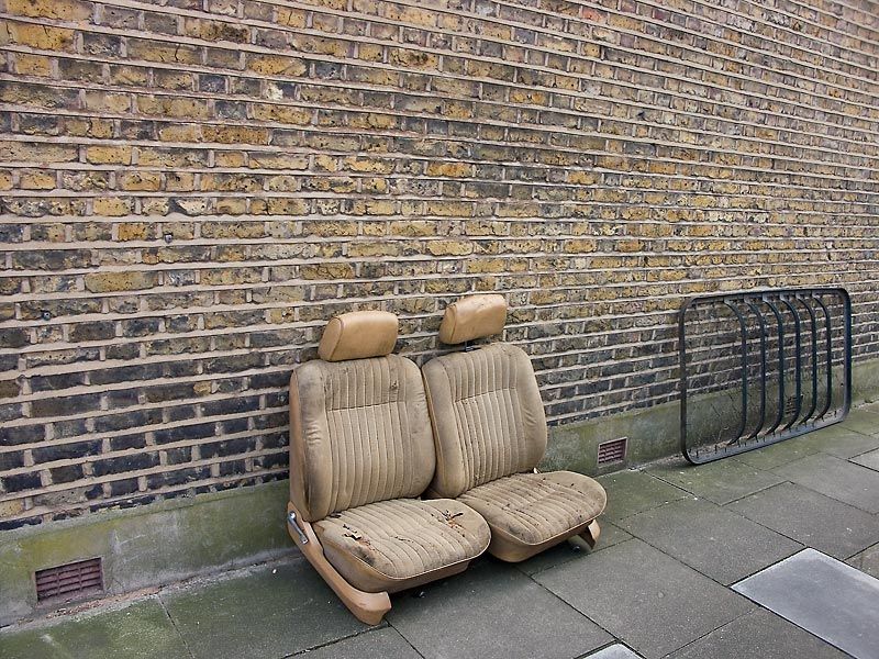
Richard Wentworth is a photographer that continually documents the “everyday”, paying attention to objects, occasional and involuntary geometries as well as uncanny situations that often go unnoticed. He does this in order to challenge our perception of communication, what does this bare couch communicate ? If anything at all. By putting the ordinary on spotlight, Richard prompts people to look past the obvious and original function of the object. Technique wise, it looks like he diversifies his approach depending on the subject matter. For example, the middle image looks like its saturation level has been exaggerated, whereas the couch image doesn't look edits at all.
|

|
|
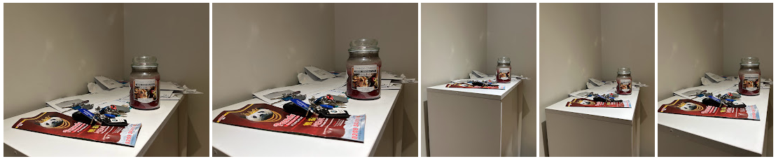
My intention is to capture different, random objects are London whether on the train, on the street, on the bus etc This links to the theme "attached" because quite literally the objects are attached to different surfaces, and the objects I capture will be in places they wouldn't conventionally be i.e the couch is outside when conventionally it would be in a home etc.
Contact sheet :


Best edits

|

|

|

|

|

|
Overall, I like the selection of images as I believe they met my objective of 'random images that are in places that you wouldn't conventionally find them in'. I also like how I made the images black and white and then reduced black and white pigment so that the images would have a slight tint. I think this gave the images more character as opposed to them just being black and white.
Strand 3
Abdulla Elmaz
Abdulla Elmaz creates fantastical surreal work with the objective to "make people dream". This is shown in the third image below as the model is lying down in the sand but vertically sitting on a chair creating this adventurous illusion. Through symmetry, shadow, and light, Elmaz wants his work to echo a story with the interpretation subject to viewer. Personally, Elmaz sees his work as a way to convey his emotions and what he's thinking in his head to the world but in a "lighter and happier way". He is inspired a lot by music, life experiences, and his interest with the universe, space and time. To create such art, Elmaz actually draws all his images before he shoots them because he want to be able to envision it and make it the best form of art possible and he also prefers to use natural light which gives a illuminous result as seen in the second image below.

|

|

|
My intention is to use different props like a chair and my model to create surrealist images. This links to attached as it is a display of what you think the person is attached to and what they're actually attached to. For example, in the first image above the model may look like she is sitting on the chair and therefore attached to the chair, when in reality she is laying on the sand and therefore attached to the sand.
Contact Sheet :


Best Edits

|

|

|
Upon reflection, I like the first and third image as they look more realistic, in terms of defying gravity, however next time I would use a more busy environment that was facing upright to contrast the defying gravity moment.
Idea moving forward
Moving onto developing 1/3 of the strands above, I have chosen to develop my work on random objects linking to Richard Wentworth. I now want visit different, random places and capture the different scenery. I hope to invoke the viewer with questions like "what has gone on, if any, and what are the attachments in the image whether is be a relationship, a family etc"
Jessica Backhaus - What still remains
Developement 1-3 Artist link
Backhaus is a German photographer who takes photographs of left-behind objects and rooms devoid of people in the 2006 project "What still remains". She does this by simply capturing these environments without any added/subtracted props or staging etc. In fact she attested that these images were purely accidental ! Her images lend to the significance of things usually cleared away or overlooked. In this, Backhaus wants us to consider and imagine where, why, and who — especially because there is no people, hence writing a story that illustrates the transience of time. For example a dinner scene with two drinks served could allude to the meeting of two people, perhaps a romantic relationship or Father and daughter time etc. Technique wise, Backhaus manages to create a composition and a muted colour palette out of random items, shadows and puddles. She picks details and meticulously frames the shots, centering on just enough information to incite the viewer's imagination. The idea of "What still remains" could also point to emotions of things lost, or what is mundane and hence left behind i.e. an empty coffee cup after a coffee catchup. Jessica Blackhaus questions and invites us to question why things have been forgotten or left behind ? and what personality and emotions is the capturing of that image evoking, in the places it has been found.

|

|
|
My intentions in this development is to capture different environments, void of people, that causes the viewer to wonder what attachments were present in that environment. Whether those places echo family, friends catching up over coffee, entertainment etc
Developement 1 - "Meet up" spots
Contact Sheet

|

|

|
Environment 1 - Best Edits
British Library
British Library

|

|
Environment 2 - Best Edits
HedgeHog cafe in Muswell Hill
HedgeHog cafe in Muswell Hill

|

|

|
When reflecting on this development, I really like how I was able to capture the end of a real catch-up between two friends at the British library in environment 1. Its very raw and is very simplistic yet you could suggest a lot of things from the image because of the different objects, the lighting etc. Next time however, I would try to be more bold in asking strangers in the “meet-up” spots if I can photograph their table when they leave. This could have given me access to more pictures, thus I would have a greater range to pick from. Nonetheless, I still believe the pictures I got were diverse and told a story.
Development 1 'Artist and Me' section
This is a side by side comparison of Jessica Backhaus' work and mine. Seeing that I drew inspiration from her work, I believe I successfully captured the message of what remains, as my image shows a coat and two coffee cups opened. In terms of composition, Backhaus took her photographs from a more face on angle, whereas I took my this photograph with my device more so lifted. However, I am pleased with my photograph and the similarities I can see as I didn't want all my photographs to look very similar to hers, but I do want there to be a visible link.

|
|
Development 2 - School
Contact sheet


|
|


Environment 1 - Best Edits
Classroom / staff kitchen space
Classroom / staff kitchen space

|

|

|
Environment 2 - Best Edits
Psychology Classroom
Psychology Classroom

|

|

|

|

|
Upon reflection, I really like the little details I was able to capture in this development as I think that really causes the viewer to question “why”, “why is this here”… like the superman figure, or the key hanging on the green pin.
Development 3 - Homes
Contact sheet
|


|
Environment 1 - Best Edits
A House in the Regants park area
A House in the Regants park area

|

|

|
Environment 2 - Best Edits
My living room
My living room

|

|

|
Upon reflection of development 3, I like how the two scenes have some similarities, but are yet so different. I like how I was able to show different aspects of similar things, like outside of a home and inside of the home i.e the living room all under the category of “home”.
Development 4
Karen Knorr - Belgravia
Karen Knorr is an American photographer who takes "objective" images which can be seen in her "Belgravia" series. In this series, Knorr explores class and power amongst the international and wealthy during the beginning of Thatcherism in London during 1979. Knorr's parents actually lived in Belgravia and the first image of the series is a photograph of her mother and grandmother in the front room of their “maisonette” on Lowndes Square. Although these are isolated images, the photographs are not about individuals but about a group of people and their ideas during a particular time in history. They are “non-portraits” in that they do not aim to flatter or to show the “truth” of these people. In addition, the people are not named and remain anonymous which was intentionally done by Knorr. Knorr decided to take "non-portraits" because historically, portraiture of the upper classes has tended to be flattering but the combination of image and text brings this work closer to satire and caricature, without losing the strong reality effect.
Knorr explained how the meaning of the work can be found in the space between image and text: neither text nor image illustrate each other, but create a “third meaning” to be completed by the viewer. The text slows down the viewing process as we study the text and return to re-evaluate the image in light of what we have read. In addition there are key words capitalised and words from conversations are broken up and laid out on the surface of the photographic paper emphasising its constructed and ironic nature. From this Knorr may want us to consider the lives of those in the image, how does the text bring life and more character to these images ? and how do these images echo Knorr's point on class and power in 1979.
Knorr's use of black and white helps the viewer focus on the bigger picture like the scene, and the text and how that links to Thatcherism in London during 1979, if the image was left with colour this may tempt the viewer to relate the different uses of colour to the individual hence moving the viewer away from Knorr's original aim (which was not about the individuals themselves).

|

|

|
Following on from development 3 where I focused on two homes, I now want to build on this by showcasing different extensions of a home and what attachments may be present in that place. Linking to Karen Knorrs work, I also like how in her images they're distinct features in the image like a dog, an elaborately patterned coat. In a similar way, I also plan to have statement pieces/objects like a mug for example that links to the person in my photograph. This could give the viewer hints about that person, what they like, what they’re interested in etc
Contact sheet
Out of 121 pictures, I chose 9 images ( a mixture of close up images, and images with people), based on the composition, facial expressions and how well the picture illustrated a story and also lighting and clarity of the image after editing. I go into further detail of my selection choices in my reflection below.
Out of 121 pictures, I chose 9 images ( a mixture of close up images, and images with people), based on the composition, facial expressions and how well the picture illustrated a story and also lighting and clarity of the image after editing. I go into further detail of my selection choices in my reflection below.

|


|
Best Edits
Environment 1 - Outside of my house


|

|
Environment 2 - My Church Lobby


|


|
In this development, I focused on 'extensions of the home' so they either could be considered as a home and or was apart of the home on the exterior i.e my outside balcony area (environment 1) and my church lobby (environment 2). Upon reflection I like and chose the first four pictures in environment 1 as they showed my mum in different lights that could invoke a story. For example, the first on the left shows my mum subtly smiling, which could imply that she's enjoying the cold evening weather. The the second left image however, shows my mum shivering thus showing the flip side of a cold winter evening. In 'environment 2', I also like the composition of my images with the people, as though I was focusing on the two models, I also captured the surrounding people and their expressions. Next time however, I would be more aware, not just of the people I'm focusing on, but the overall environment as I could have captured the people in the background more widely for example the baby and the mother on the left side of the images. I also really like the close up images as they reveal more of the person (who they are, what they're doing etc), for example the image with the bible open gives more context for what type of book the girls had, what they were reading etc. Next time to improve my pictures, I would also make sure the white balance is appropriately set as some images in environment 2 look quite saturated which is not what I was initially going for.
Development 5 - Rooms
Martin Parr - Signs of the Times
Martin Parr is a British documentary photographer, that is best known for his use of highlighted, saturated colour. He often looks into aspects of modern life, regarding social class people and more broadly the wealth of the Western world. In His project "Signs of the times" based on the BBC television series of the same name, Parr takes a look into homes of people in the early 90's and explores the extraordinary range of emotions that lie behind household décor, from the dramatic curtain shapes, to the colour palettes etc.
In this series Martin Parr is also addressing wider issues of consumption, materialism, and status (economic and social status) and how peoples homes, in his opinion, is a reflection of their values and tastes etc; but also how this has been shaped by consumer culture. Through his photographs, he highlights the ways in which homes have become showcases for social status and cultural identity, and how they are increasingly used to communicate values and aspirations. This can be seen in the first and third image below for example, as the first image shows the house to be more uniformed because the colour palette is the same (pink), both ladies are in fancy dresses with heels on looking away from each other and decoration wise they have elaborate and expression curtain drapes. In contrast, the image on the far right shows a man and a women in more casual clothes, without shoes on standing behind a neutral wall and the colour palette in the room isn't as uniform. Therefore, some may consider the first image to look more sleek and upper-class whereas the image on the far right looks more chill and homely in comparison. In addition, the models in Parrs photographs also almost look doll like, so perhaps it's like Parr has entered a frozen moment in time and captured the environment at hand. As well as the wider issues Parr is addressing, he may want us to consider how the decorations are connected to the individuals in the photographs. For example in the first image below, maybe the owners favourite colour is pink as the lady's dresses, curtains, sofas, pillows and carpets are different saturated shades of pink ! Technique wise, the use of saturation in general, also adds to the individuality of each home which links to Parrs point of how peoples home are a reflection of their taste, culture, values etc. In addition, Parrs composition in this series is consistently simple and symmetrical, creating a more uniform typology of the rooms. The expression of all the subjects is also uniform and neutral, allowing their character to be portrayed through other elements besides the room like their poses, clothing choices etc.
Parr was interested in these issues because he believed that peoples homes are not only a reflection of themselves but a reflection of the society and culture. He wanted to show how consumer culture has infiltrated every aspect of peoples lives, including private spaces, and how it has shaped values, aspirations, and personalities. Through his photographs, Parr encourages us to reflect on our own relationship with consumer culture and to question the impact that it has on our lives and the world around us.

|
|

|
Following on from development 4 where I focused on extensions of the home, I now want to get more personal and go into peoples bedroom in order to capture their different and raw aesthetics. Whilst I am taking inspiration from Parr (context and purpose wise), the people in Parrs images look more doll like and the places in their home look done up whereas I want my images to look more relaxed similar to that of Adrienne Salinger's "In My Room: Teenagers in their bedroom". Therefore I also want the state of my models rooms to not be "done up" or even tidied up, as that would change what it would have been had I not have been there.
Contact Sheet 1 - series 1
The left image shows my selection process and how I organised my pictures, to obtain the best edits. I first began with all the pictures take, and then I selected 66 images that I liked due their quality, composition, type of image etc. I then began to edit some of these images by experimenting with the vibrancy, saturation and brilliance etc to being out the different colours such as red, yellow and gold. This allowed me to narrow down my pictures even more. At last, I had picked 18 images that I planned to split into 3 sets. They were a mixture of close up images and images focused on the model that showcased the models personality and style.
As mentioned before, the composition of Parrs work in this series is consistently simple and symmetrical, creating a uniform typology of the rooms. When making my three sets of images, I echoed this making sure the sets followed the same format i.e : the images with the model were on the left and enlarged, the smallest, landscape images were put in the middle along with a small portrait image below it. Then I enlarged the last portrait images that had yellow accents in them to work in harmony with the yellow walls in the other big pictures on the left (as 2/3 of the walls with the model in it was yellow). This typology, scrapbook look is something I will perhaps further investigate in later developments i.e physical collages etc

|


|
Best Edits

|
|


|


|

|

|


|

|
Contact sheet 2 - series 2
The left image shows my selection process and how I organised my pictures, to obtain the best edits. I first began with all the pictures take, and then I selected 66 images that I liked due their quality, composition, type of image etc. I then began to edit some of these images by experimenting with the vibrancy, saturation and brilliance etc to being out the different colours such as red, yellow and gold. This allowed me to narrow down my pictures even more. At last, I had picked 18 images that I planned to split into 3 sets. They were a mixture of close up images and images focused on the model that showcased the models personality and style.
As mentioned before, the composition of Parrs work in this series is consistently simple and symmetrical, creating a uniform typology of the rooms. When making my three sets of images, I echoed this making sure the sets followed the same format i.e : the images with the model were on the left and enlarged, the smallest, landscape images were put in the middle along with a small portrait image below it. Then I enlarged the last portrait images that had yellow accents in them to work in harmony with the yellow walls in the other big pictures on the left (as 2/3 of the walls with the model in it was yellow). This typology, scrapbook look is something I will perhaps further investigate in later developments i.e physical collages etc

|


|
Best Edits


|


|


|
Overall when reflecting across the two series' in these developments, I am very pleased with the images I obtained. In series 1, I really like the vibrancy of the room and I like the way I formatted it. In contrast, series 2 is a much darker room, cool tone room. In series 2, I like how natural the image with the dog is and when he's on his bed. I also like how the pictures all fit together like a puzzle.Whilst I do believe I captured images that looked more relax, especially in series 2, I also believe I got images that look more staged which is not necessarily bad and I still think it worked.
Development 5 'Artist and Me' section
In my image, I took advantage of my models yellow wall and other belongings on her bed, and exaggerated the saturation and vibrancy. This technique was taken from Parr, and I think it really worked well to bring all the colours out in my models room. As mentioned in my analysis, Parrs work does look more doll like at times, and that it were I wanted our work to differ slightly, which I believe is evident because whilst my model was in the middle of a pose, she is in her bed and I made sure her room wasn't cleaned up or "fixed" etc as I wanted to get her raw bedroom at that time.

Martin Parrs Photograph
|

My photograph
|
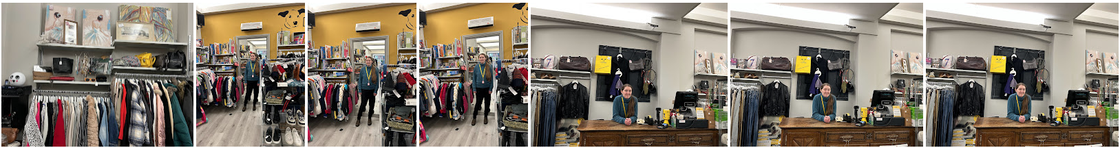
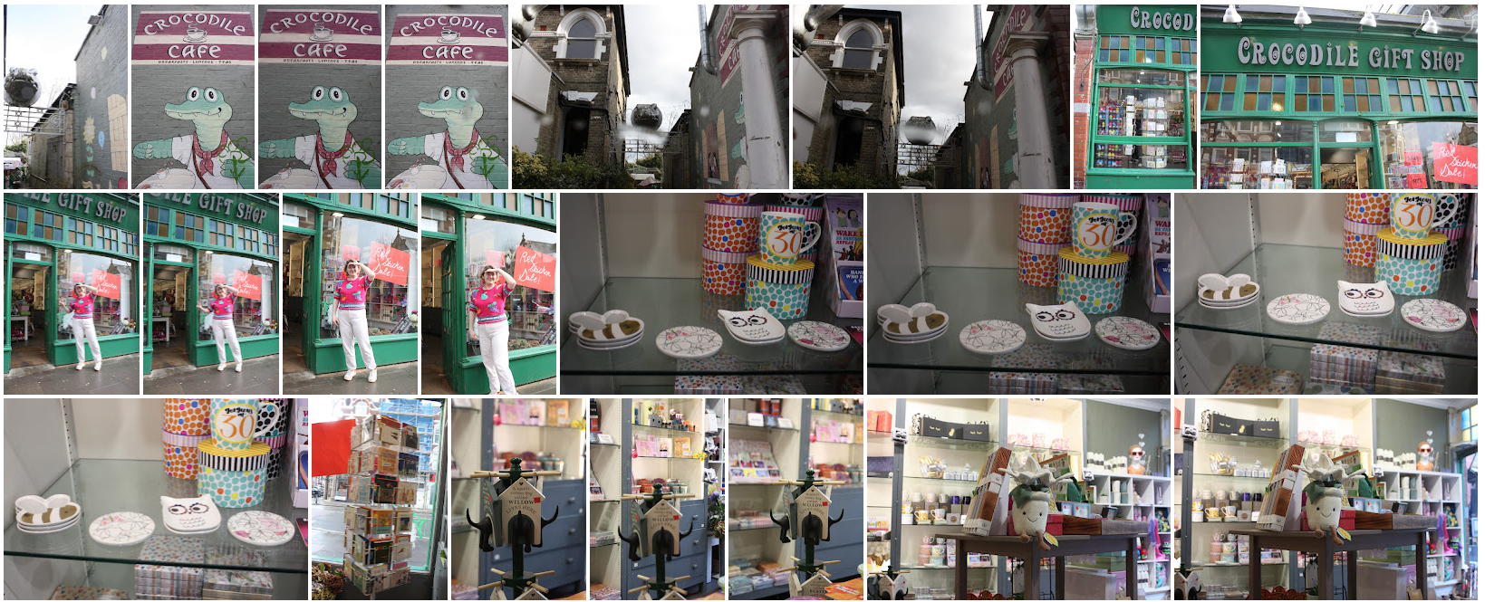
Development 6 - Shops
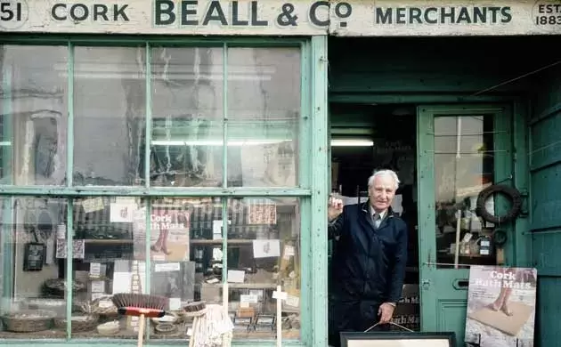
John Londei - Shutting up Shops
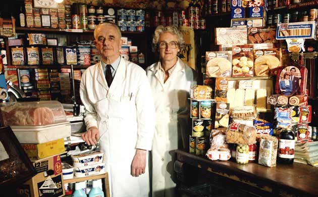
John Londei is a British photographer, who shoots commercial and portrait photography. In 1972, photographer John Londei started taking pictures of small independent shops in Britain that were in decline. Often family-run businesses, well-established in their local communities. Londei strove to capture the timeworn presence of these diverse business and people; the butchers and bakers, button makers, cobblers, fishmongers and chemists of the high streets. Over a fifteen-year period, he photographed 60 shops. In 2004, when he retraced his steps and revisited the shops he'd photographed, he found that only 7 of the 60 businesses were still running. His subsequent book of the series, Shutting Up Shop is a fitting tribute to Britain's independent retailers.
Londei considered the influences of these shops, like the pharmacy in Leather Lane, London. It wasn’t just about the products people could get from the shop, but also the multifarious ways in which the shop could help the human interpersonally via advice, for example. Building on this, John Londei may have wanted us to consider the history behind these shops and the sentiment of family, community, and time etc especially because many of those shops have now been shut down. Technique wise, in Londei’s photographs, there was usually a soft-feather like black lining along the sides of the images. This not only makes the image look more dated, looking at it many years later, but it also draws the viewers attention to the people in the photograph; which links back to Londei’s objective on focusing on the people behind/connected to the shop, that looked after the community not just with products but with their words and heart.
Londei considered the influences of these shops, like the pharmacy in Leather Lane, London. It wasn’t just about the products people could get from the shop, but also the multifarious ways in which the shop could help the human interpersonally via advice, for example. Building on this, John Londei may have wanted us to consider the history behind these shops and the sentiment of family, community, and time etc especially because many of those shops have now been shut down. Technique wise, in Londei’s photographs, there was usually a soft-feather like black lining along the sides of the images. This not only makes the image look more dated, looking at it many years later, but it also draws the viewers attention to the people in the photograph; which links back to Londei’s objective on focusing on the people behind/connected to the shop, that looked after the community not just with products but with their words and heart.
|
|
In development 5 (the previous development), I focused more intimately on the inner spaces of the home i.e the bedroom, however following on from that, I now want to investigate the intimate setting of people's business. Although it may not look like an intimate space on the surface level, however I want to investigate the unique stories behind each store I visit. Why does the employee work there ? What is their attachment to that shop ? What attachments does the viewer think is present in these shops etc So overall I am investigating the intimate attachments between a shop and the employees and challenging the viewer to do so as well.
Contact Sheet
This batch of contact sheets are from 3 different shoots I did, however I didn't like the results due to various factors such as ISO levels, the weather (it was raining in one of the shoots) and and just the "look" of the images. I did continue to take more picture however which can be seen further below.

|
|
|

|


|

|
When reflecting on this shoot, I would really try and focus on my composition next time, making sure I'm taking my images face on so they're straight. I would also make sure my ISO is appropriately set so the images aren't too dark and just generally be bolder and take my time when shooting these pictures.
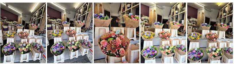
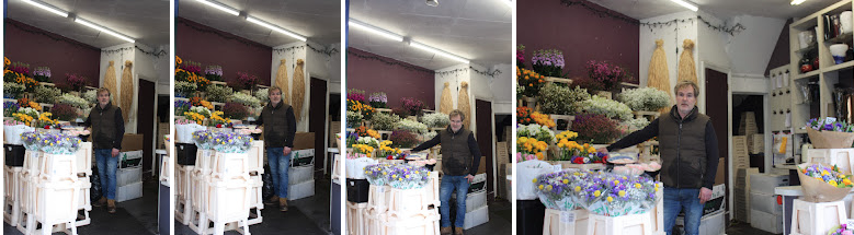
Better developments on the investigation of shops and the employees attatchements to them.
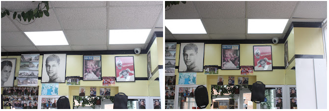
Contact Sheet 1 - Barber Shop

|

|
Best Edits
Barber - Gents Hairdresser

|

|


|
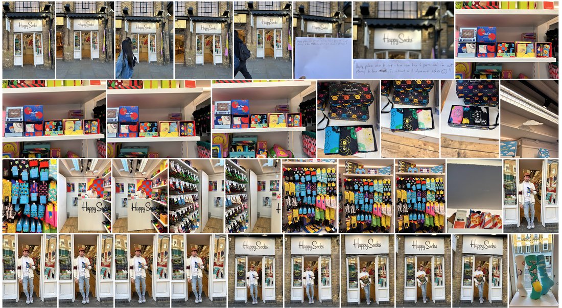
Contact Sheet 2 - Sock Shop


|
|
Best Edits
Giovanni - Owner of 'Happy Sock'

|


|


|
Contact Sheet 3 - Leather goods shop

|

|
Best Edits
Russel - Craftsman at 'Gohils'

|


|


|
Overall upon reflection, I really like the simplicity of the main images, paired with the detail shots which give more information about the person/shop. I believe I had also worked on being more bold and taking my time to get to know the employees to make the shoot feel more relaxed which meant I could take more time when taking pictures, thus they came out better. Next time I would be careful to not cut any feet off, which I improved on in my last best edit images.
Development 7
KayLynn Deveny - The day to day life of Albert Haystings
Kaylynn Devaney creates intimate, sensitive photographs that often explore the theme of memory, identity and the human experience. These series involve Deveny collaborating closely with her models and immersing herself in their daily lives thus creating trust between her and the people, in which she can capture the intimate and thought provoking photographs. In the series " The day to day life of Albert Hastings", Deveny wants us to consider the quiet moments of a persons life, and the significance of small details in one's life.
Deveny began to learn more about aspects of Alberts life, including his experience living through WWII in Britain, his work as a general engineer, and his relationship to the flora and fauna outside his building. She considers and often seeks to photograph the banal moments of the day—the experiences not usually considered significant enough to warrant a snapshot and also she looks out for domestic patterns and practiced daily routines like ironing show in image 1 below. Early in the project, Deveny was provoked to wondered how her perceptions of Albert differed from the way he saw himself. To better understand his feelings about being photographed and his reactions to my photographs, she asked Bert to caption small prints which would then lead to the book. Deveny was interested in this Alberts life and in making this series, because she was struck by his positive outlook on life, despite having experienced loss and significant challenges in life. As well as this, she was intrigued by how his routines and objects reflected his unique personality and life experiences.
Technique wise, Kaylynn Deveny uses everyday objects in his house and nature i.e leaves like in image 2. As well as this, he collaged the images with Alberts handwritten notes which is an aspect of her work I really like, as it gives context to these everyday images.

|

|

|
In my work, I wanted to incorporate Deveney's technique, in regards to the notes. Therefore, in this development my intentions is to use his Deveney's technique to give the viewer context into the attachments the shop keepers have with their shops. Perhaps this will differ from what they're original thoughts were.
Editing process
Best Edits

|

|
When reflecting, I believe the black and white tint make the image look even more simplistic, which gives the viewer the ability to just sit and reflect on the image and the note. I also think the black and white makes the note look more connected to the image above so it’s a more cohesive image. I now plan to take more pictures in this style, to broaden the amount of images I have.
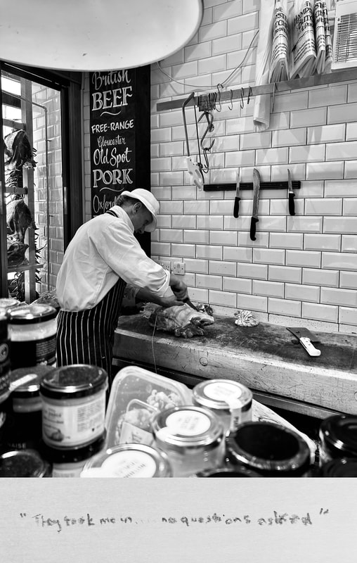
Development 8 - further shoots
Whilst I wanted to take further shoots of what I did in development 7, I also wanted to experiment with live work, so actually capturing the employees in action.
Contact sheet :

|

|
Best Edits
|

|
When reflecting, I enjoyed how I was able to capture a family, which broadened my investigation. I also like how I was able to get the butcher in action, although I wasn't allowed to get super close i.e over the counter, I think the outcome was good.
Experimentation
Using my photographs from the butchers visit, I decided to experiment with movement by making a gif. This way, you could see more of the persons job in action and relate that back to their note.
Method:
To achieve this gif, I manually scrolled through my camera roll and tried to create a jagged rhythm. Then I edited it, making sure the different lighting in each picture worked harmoniously with each other.
To achieve this gif, I manually scrolled through my camera roll and tried to create a jagged rhythm. Then I edited it, making sure the different lighting in each picture worked harmoniously with each other.
Reflecting on this work, I like how the lighting changes throughout the gif. It looks like flickering lights at times which adds to the experience of watching it.
Final Piece

Anneate Messanger - Mes petites effigies
Forrest Frank is an American, Christian singer song writer. In his music video with American rapper Huvley, "I am no longer bound", I was drawn to one of the scenes (as seen below) which show a collage of different people, and they're testimonies. Frank and Huvley originally filmed a 10,000 dollar video and whilst it looked "cool", they said it was missing the heart of God. So they pivoted and instead decided to invite Christians all over the world to share they're testimony of how God has set them free from bondage. I really liked how the huge collage below, with so many different stories. I also liked how it looked layered and some images were horizontal, some were vertical, some notes were up close and some were more far apart. It just adds more texture to the image. The image below, fed into my vision for my final piece which I go into detail on below.

Screenshot from the Forrest Frank and Huvley - I am no longer bound music video
|
Forrest Frank and Huvley - I am no longer bound music video
|
With this being said, in my previous development, I displayed different attachments shop keepers had to their shop. Whether that be family, faith, culture, a feeling etc. Now I want to look at the bigger picture i.e how customers/people, that have been to that place, have been impacted by the shop; what attachment do they have to that shop via a memory, childhood etc, and I will also ask them to summarise they're attachment in note form. I then plan to go to that particular shop, and get to know what attachment the store keeper/employees have with that place; and also ask the employees to summarise they're attachment to that place. After this, as seen in the sketch down below, I plan to physically connect the peoples pictures and their notes with strings. Through this display you’ll be able to see different attachments people have to one place, whether different or similar.
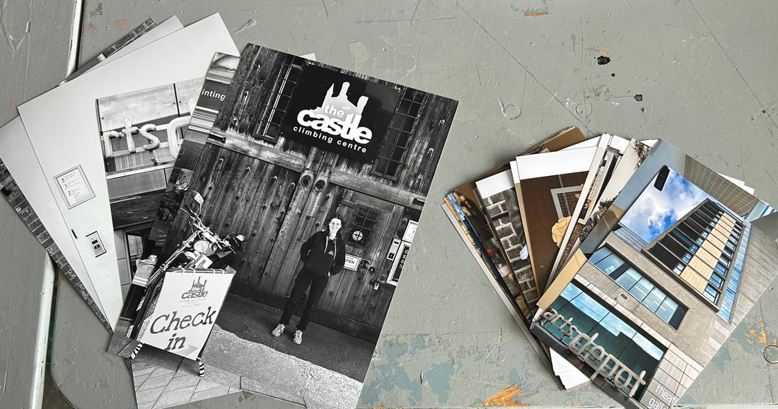
As I will be taking pictures of people in different environments, to link it further I will try to replicate the “vibe” of the shop onto the background of the person I asked. For example, I asked Jasper what places he had an attachment to and we landed on the castle climbing centre and this place has a wooden, rustic exterior. Therefore when taking pictures of Jasper, I used a background with bricks to connect to that old, square/rectangular pattern.
As I will be taking pictures of people in different environments, to link it further I will try to replicate the “vibe” of the shop onto the background of the person I asked. For example, I asked Jasper what places he had an attachment to and we landed on the castle climbing centre and this place has a wooden, rustic exterior. Therefore when taking pictures of Jasper, I used a background with bricks to connect to that old, square/rectangular pattern.
Preparation

|
|

IMG X3
|
Contact sheet


Slideshow of final images I will be in my physical final piece :
Physical preparation :
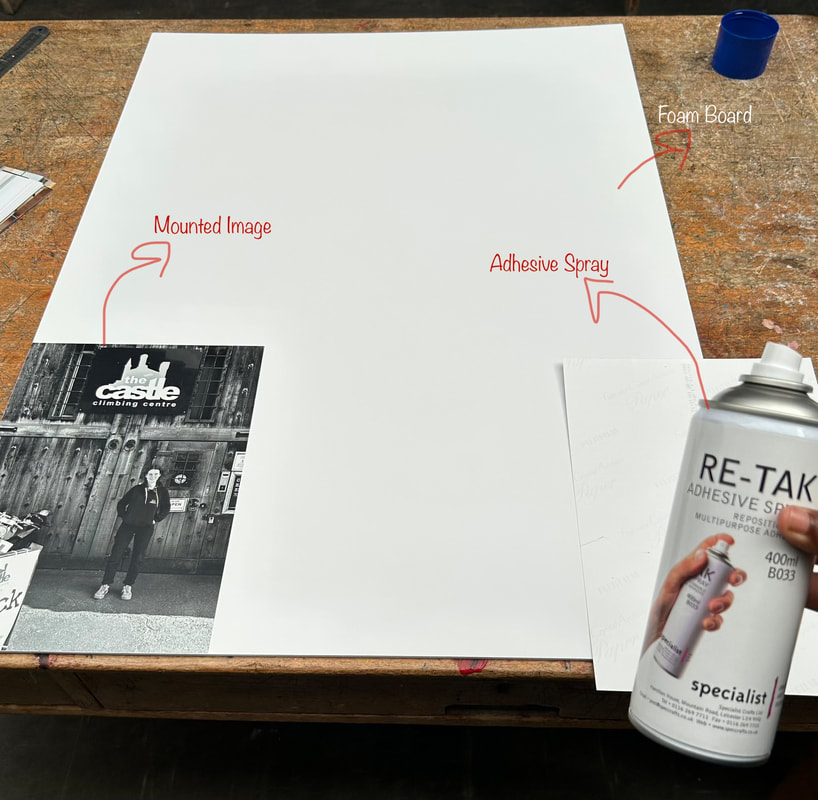
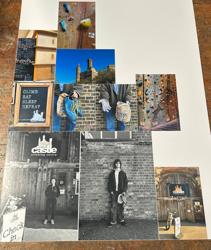
Once printed, I mounted the images individually onto foam board using adhesive spray and then I cut them out using a scalpel knife. I later also mounted the messages onto foam board. Then I weaves string through each image and connected images together using the string, like the notes. This aided in achieving the objective of the project towards the end, which was to show the connections between different people and their “special place”, a sentimental place and as the theme is…. A place that they have an attachment to, but also to see interestingly enough how each persons thoughts towards ‘their place’ were similar or differed.
|
|
Physical Final Piece - see physical display
Final Evaluation :
In terms of my intentions and vision for this final piece ,in relation to what I’ve developed so far and the meaning behind this piece, I believe my final piece was displayed very beautifully and quite simply as well. Initially, I wanted to use more people and have a huge display almost like an evidence board usually associated with fictional detective activities. In this, the audience could scour endlessly through the piece, seeing the interesting connections between each person and how one place can have a (similar/different) affect on an individual.
However, I decided to stick with three main people and travel to their chosen place, where I would meet three other people that either worked there or owned the place. This resulted in a smaller piece physically, but this is a positive thing because it allowed the piece to be more intimate and close-knit and I felt the connections between the notes etc were very heart felt. So my final piece differed in that, it allowed the audience to reflect on the 6 people in front of them and what they had to say instead of looking at so much in one piece. Allowing the audience to really reflect on the pieces was key here and fits very well with the theme “attached” because from a psychological point of view, learning about peoples “attachments” often involves a lot of listening and reflection so in the end the intimate piece with viewer stories allows the reader to really analyse the stories and attachments of the people presented.
In terms of the actual quality, technique and composition of the images, with the picture on the top right I should have taken it in a different environment so I wouldn’t have to manipulate the image (in editing) so much in which it could affect the quality of the image. I noticed this more so when the images were printed out so this is something I would keep in mind next time. On the flip side, I really like the images in the middle. I felt the natural light outside really aided the picture and I love how relaxed the top image looks. I also really like how the materials of the buildings are abit similar so it makes the images look even more connected together highlighting the objective further.
The Whole development of "Attached"
|

|

|


|

|

|

|

|

|

|

|

|

|

|

|
|

