Structure
- The city's changing architecture is a kind of memorial of humanity's endeavours and schemes, for all buildings have been fashioned according to the ideologies of their days.
Brutalism
The French term Béton brut other wise known as Brutalism translates into "raw concrete". This came about in relation to the future of modern architecture which started after the British war when mass buildings i.e offices needed to be built again. The structure is characterised by the large size and the use of raw unfinished concrete hence Béton brut. Brutalist buildings also make use of geometric forms in a way to attempt to communicate the buildings function and what the rooms behind the slabs of concrete are used for.
Simon Phipps
Simon Phipps is a photographer who grew up in Milton Keynes in the 70s alongside architect parents. Due to his early experiences Phipps was intrigued by the rationalist geometries of the early modernist estates in his town which were composed of cast concrete and were forcefully detailed. This drew Phipps to the brutality of buildings and thus the later series 'New brutalism'. Phipps created this series by shooting several brutalist buildings such as Trellick Tower, the Brunswick Centre whilst focusing on the negative space, line and perspective of the buildings and the form and shape. Through this Simon Phipps wants us to consider the stance and boldness in the buildings and how the potential for artistic and social change is embodied in the uncompromising work in brutalism. provides a unique perspective on Brutalist structure, throughout his 15 years of photographing in the UK. He also creates surveys of photographic images to demonstrate the breadth of the controversial style.
Phipps work was based on the modern architectural movement post 'World War II' where there was a pressing need for new buildings after mass bombing had occurred. The movement also took inspiration from ideas of functional simplicity hence the very lean buildings occupied by several offices or homes. It appears that Phipps was additionally interested in the topic due to the contextual nature of housing which he had seen first hand in his earlier years.


Task 1
In this task I visited brutalist buildings across London like the barbican or the national theatre and focus on capturing the building and its structural makeup. I also had to consider the negative space, paying attention to line and perspective as well as the shape and the form of the buildings. In this task I noticed that in every angle you can see a new perspective of the building whether from below, or straight standing etc which fulfils the intention of Phipps I believe which was to almost showcase the never ending refined beauty of the buildings which have been criticised in the past.
In this task I visited brutalist buildings across London like the barbican or the national theatre and focus on capturing the building and its structural makeup. I also had to consider the negative space, paying attention to line and perspective as well as the shape and the form of the buildings. In this task I noticed that in every angle you can see a new perspective of the building whether from below, or straight standing etc which fulfils the intention of Phipps I believe which was to almost showcase the never ending refined beauty of the buildings which have been criticised in the past.
Contact sheet
Centre Point and The National Theatre
Centre Point and The National Theatre


Chosen Edits
Negative Space

Line and Perspective

|

|
Shape and Form

|

|
WWW:
The subjects I chose to photograph and the way I photographed them suited the theme as they were brutalist buildings and when photographing my composition allowed me to achieve images which good line and perspective, shape and form aswell as negative space.
EBI:
Next time I would go to several brutalist buildings so that I could have more of a variety in structure. This would allow me to have more images with negative space for example if buildings have a different composition that i can capture.
Thomas Danthony - Brutalism
Thomas Danthony is a French born, London based illustrator. Danthony creates graphic simplified designs of different types of buildings, for example brutalist buildings. His illustrations follow a monotone colour palette of white (grey, black), with a black background which draws the attention to the block structure of the buildings. His technique and composition of flat colours and the monotone palette creates a sleek and graphic effect.

|

|

|
Task extension
In this task I was required to take some of the brutalist images I took and simplify them on photoshop. To do this I used "the polygonal lasso tool" to select the different shapes, then I used the filter > average so the selected image would take the average tone; thus simplifying it. I also would simplify the background to black as per the style of Danthony, and when there was stand out features like a tree I would use the bucket tool so that it would be mostly black but still keeping the shape and highlights so it could be recognised as a tree. This task links to the brutalist simplification theme as it shows the flat colours of the buildings once edited and the editing software we used also allowed us to explore the style and pattern of Danthony's work.
My Edits

|

|

|
WWW:
I was successfully decisive in what structures of the buildings or features (birds, trees) I kept in or not which allowed my final images to be simplistic and yet having subtle details like buildings in the background or a tree like Danthony's images
EBI:
Next time I could try to simplify images from the line and perspective image aswell.
Break the Structure - Thomas Keller
Thomas Keller creates visually reconstructed images of famous landmarks, through a technique he invented called visual analytical synthesis. Keller does this by using the traditional process of film photography to create montages. With just one roll of film he shoots multiple images of the same landmark from different angles in preparation for the re-arrangement later on. Then he re-arranges the multiple exposure images on the contact sheet to make images comparative to that of a montage or collage .This creates a reconstructed effect from the viewers perspective and helps to support his idea about multi-perspective approaches. In this he wants us to consider the wider issue in photography of what fine art, and if it can only be categorised by the traditional renaissance pictorial concepts . This is shown in his process in making the final piece from starting with the normal images but rearranging them in the contact sheet offering an alternative way to visually process these landmarks and their structure.


Architecture - bracketing
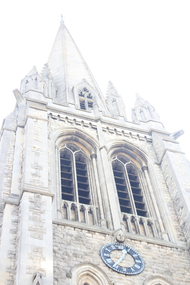
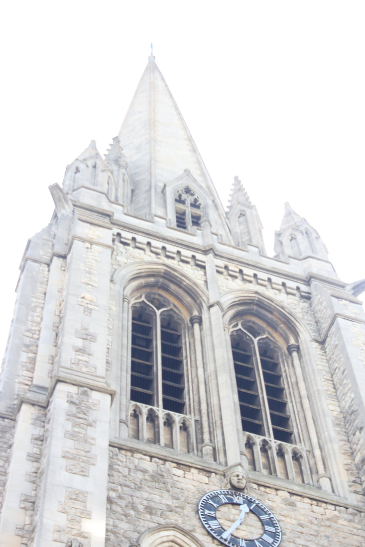
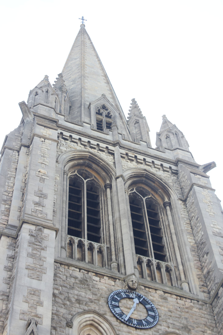
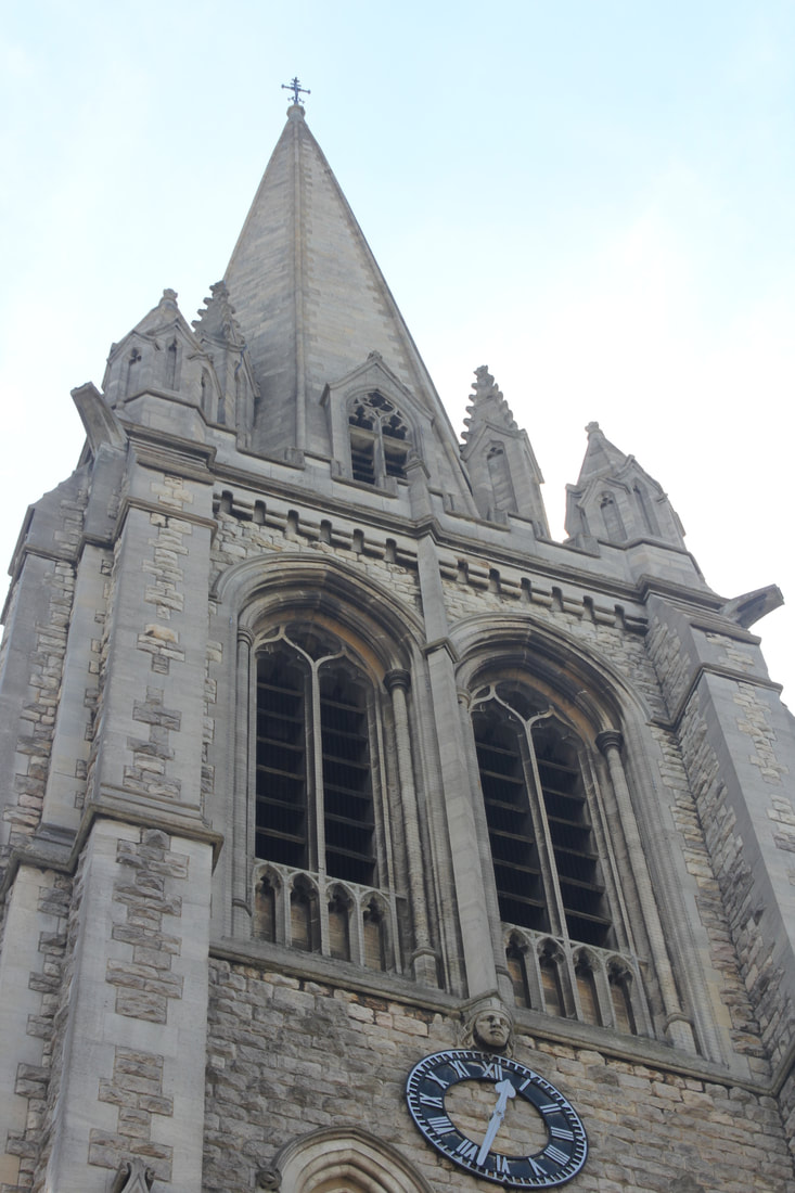
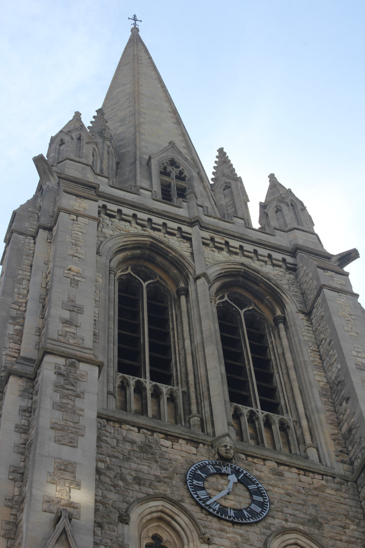
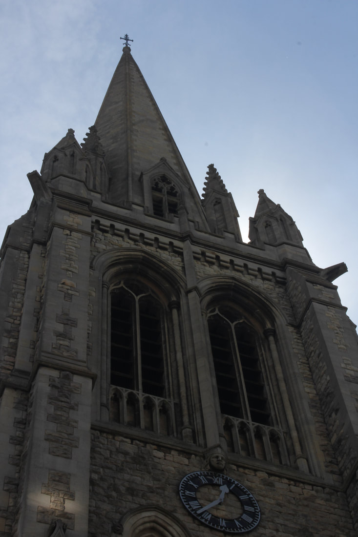
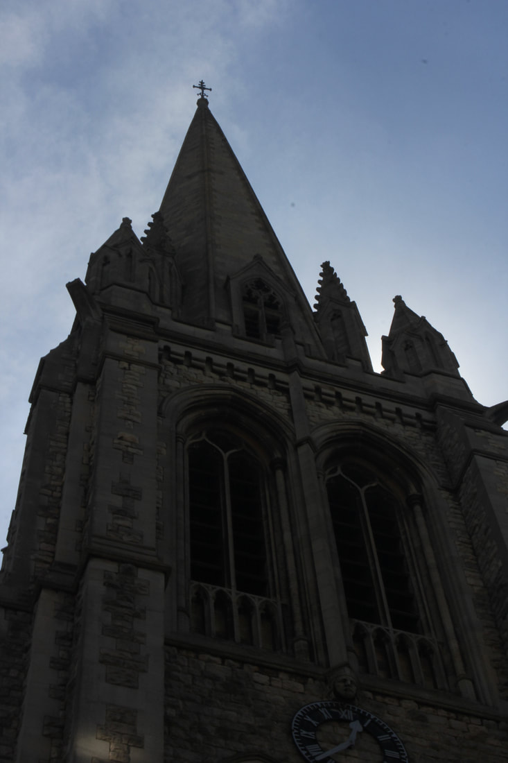
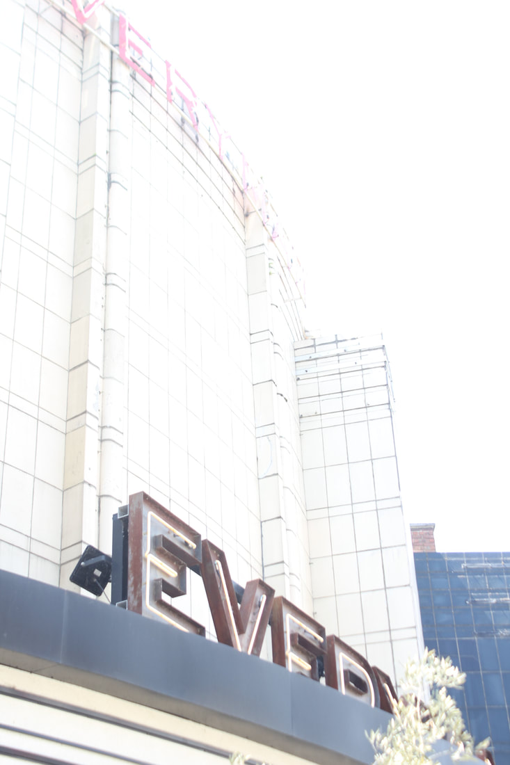
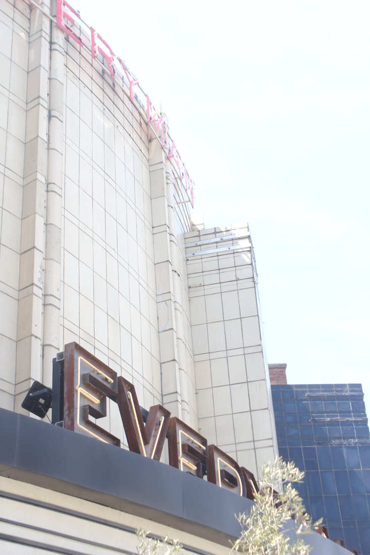
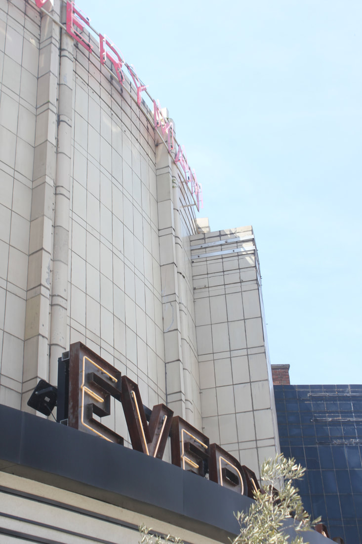
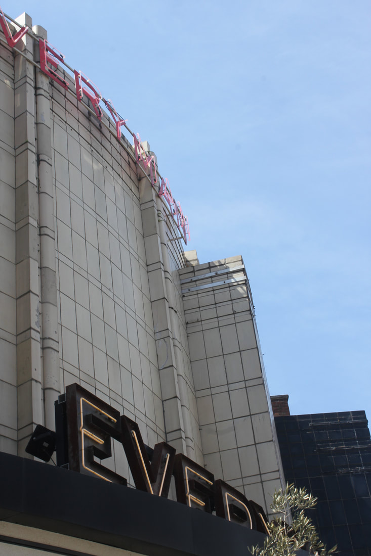
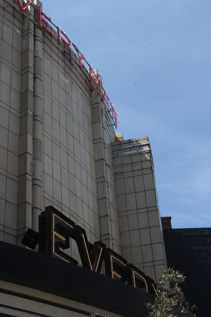
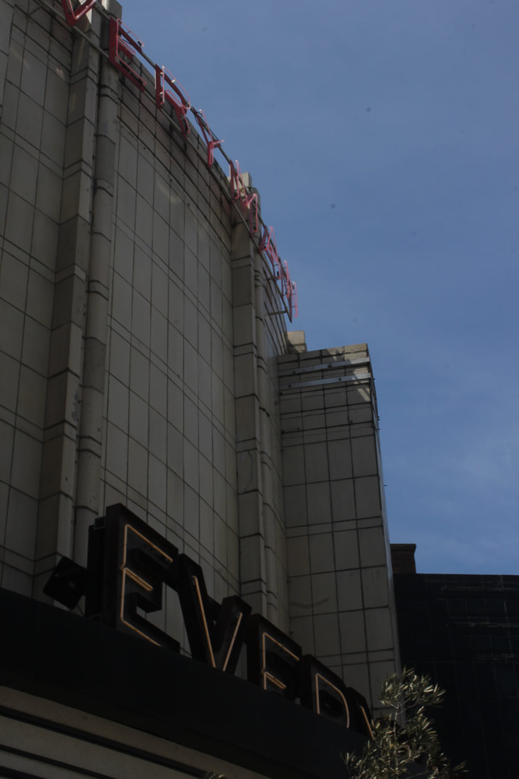
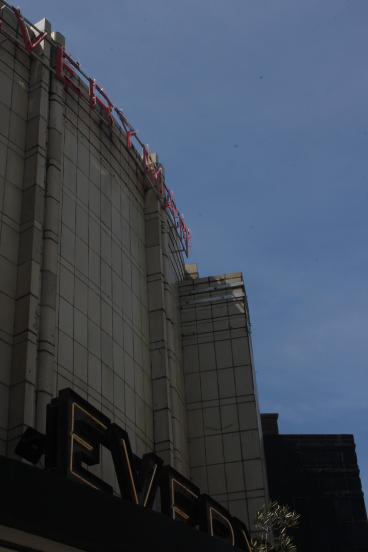
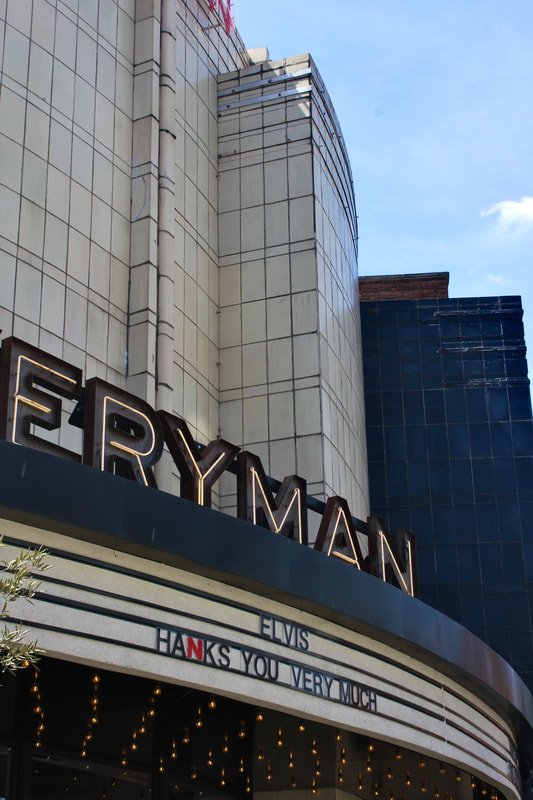
Task - The Church vs The Everyman cinema
Bracketing:
Bracketing is a photography technique that consists of capturing the same several with different camera settings, for example 0 +1,+2,+3 or -1, -2, -3. This will cause your image to vary in exposure i.e. lighting and can be beneficial when for example in this tasks you are taking images of buildings towards the sun. To use the bracketing function you need to press the AV button and then use the scroll dial to change the settings, of which can be seen in the labelled diagram below.

In this task I photographed St James Church and the everyman cinema, due to the architectural differences and locations as once compared you could see the effect of the sun towards or behind the buildings and how bracketing would affect this. I used a shutterspeed of 50 and ISO 100.
Bracketing series 1
|
+3
|
+2
|
+1
|
0
|
-1
|
-2
|
-3
|
|
|
|
|
|
|
|
Bracketing series 2
|
+3
|
+2
|
+1
|
0
|
-1
|
-2
|
-3
|
|
|
|
|
|
|
Upon reflection I realised the best exposures was 0 and or -1.5 for both the church and the cinema, as it wasn't too dark but had an exposure that allowed for the details of the structure to be shown appropriately.
Best edits
|

|
WWW: I successfully created a bracketing series where there is a notable differences in exposure
EBI: Next time I would want to pay more attention to the focus of the pictures, to allow for a crisp and detailed outcome of the image
EBI: Next time I would want to pay more attention to the focus of the pictures, to allow for a crisp and detailed outcome of the image
Twisted structure - Nicholas Kennedy Sitton
Nicholas Kennedy Sitton is a San Fransisco based photographer who created a set of images as a result according to him of how intriguing the concept of distortion translates to architecture.
“These photos are a result of how intriguing the concept of distortion translates to architecture. It creates a sense of falling into itself, like capturing a moment of demolition. I can destroy titanous steel structures with the click of a mouse and create new twisted versions of reality. I was also inspired by San Francisco. I had just moved here and being a new city was disorienting and exciting and I wanted to capture how my whole world had changed.”
“These photos are a result of how intriguing the concept of distortion translates to architecture. It creates a sense of falling into itself, like capturing a moment of demolition. I can destroy titanous steel structures with the click of a mouse and create new twisted versions of reality. I was also inspired by San Francisco. I had just moved here and being a new city was disorienting and exciting and I wanted to capture how my whole world had changed.”
* I wasn't able to edit the images in Sitton's style due to the keyboard and photoshop difficulties
Structure in nature - Myoung Ho Lee
Myoung Lee is a young artist born in 1975 from South Korea who creates surreal and elaborate images that pose some unusual questions about reality, art and perception. He does this by considering 4 points: the selection of the subject which is usually trees of different shapes sizes and widths/heights. Separation of the subject which he does by using a distinct large white canvas backdrop, in the middle of the natural landscape. This allows the trees to be framed in a solitary way, however noticeably you can still see the background, which spotlights the tree further. Thirdly Lee uses a technique when photographing called the 3rd line rule as the tree usually is positioned in the second 3rd of the image and the tree is in the middle of the canvas. This composition encourages balance and dynamism as images in the centre can sometimes look static and cause viewers to look away quickly. However the third line rule allows for there to be discovery in looking at each section of the image and it also balances out the negative space(how?). This results in a separated, ambiguous and meta subjected image that forces the viewer to not just notice but ponder on the beauty of nature. The stillness of the photo also accentuates the beauty (still life arrangement), the tree is not flowing about but more so stationery like a piece of art in an exhibition. (context how many people helped him, the success rate of the image etc).

Myoung first began photographing trees in 2004 with the intention to reposition common elements such as trees that we don't often notice to celebrate in its unique structure. Myoung went through a quite tedious process with this project by constructing a temporary studio with the help of a large crew and heavy cranes as seen in the image, however he desired more so to capture the organic structure than to heavily intervene which may have caused the image to look unnatural. In this way it could be said that Lee is not making surreal images but rather using apparatus such as the white background to highlight the beautiful features and structure of the trees of which we overlook in our everyday life. So the separation element isn't an attempt to create a surreal image but to highlight the surrealism of nature itself. Myoung Ho Lee considers bigger issues in society, perhaps how we overlook things we become familiar with seeing such as the trees, yet when spotlighted in such a way we are able to process not just the tree but the beauty in nature. This is clear in his intentions and composition but also in his series taking different types of trees at different times of the day to really explore the variety in nature and their individual elegance that is not always seen collectively. This in my opinion does create a surreal effect which is telling of what familiarity can do to beauty as Lee only captured and isolated what was already there not necessarily create.
Photography - dipping film into time and space for a moment
-Myoung Ho Lee
-Myoung Ho Lee

|

|

|
Task
In this I was required to go to x woods and take several images using different size cards, A4, A5? and I also had the option to experiment with transparent paper. We were to take images in the style of Lee with ranging images of up-close shots but also images that included the background. I used my camera and also my phone. With the cannon I adjusted the ISO frequently, I started using an ISO of 200 which I found was too dark so I used an ISO of 6400 and 3200? This combated the lighting issue however it did make the image blurry so I had to diversify my composition and which objects I was taking to allow as much natural light to be seen on the image as possible. I also used a shutter speed of 1/60 with the settings on TV and manual focus ; as well as experimenting with bracketing. This task links to the theme as we were isolating our chosen images to highlight its structure like Lee's images and we also explored the depths of field, composition and focus. For depth of field and focus, when taking images with some of the background included this allowed the focus to be on the central subject thus highlighting its features. The composition aspect affected how balanced and dynamic the image was, if there was more negative space or not and if this had a positive or negative impact on the image.
In this I was required to go to x woods and take several images using different size cards, A4, A5? and I also had the option to experiment with transparent paper. We were to take images in the style of Lee with ranging images of up-close shots but also images that included the background. I used my camera and also my phone. With the cannon I adjusted the ISO frequently, I started using an ISO of 200 which I found was too dark so I used an ISO of 6400 and 3200? This combated the lighting issue however it did make the image blurry so I had to diversify my composition and which objects I was taking to allow as much natural light to be seen on the image as possible. I also used a shutter speed of 1/60 with the settings on TV and manual focus ; as well as experimenting with bracketing. This task links to the theme as we were isolating our chosen images to highlight its structure like Lee's images and we also explored the depths of field, composition and focus. For depth of field and focus, when taking images with some of the background included this allowed the focus to be on the central subject thus highlighting its features. The composition aspect affected how balanced and dynamic the image was, if there was more negative space or not and if this had a positive or negative impact on the image.
Contact Sheet -mixture of camera and phone


My Response
series 1 -
For these images I put the piece of paper over the tree allowing it to balance, I used quite a high ISO in order to have a brighter image due to the angle I was taken the images from.
For these images I put the piece of paper over the tree allowing it to balance, I used quite a high ISO in order to have a brighter image due to the angle I was taken the images from.

|

|

|
series 2 -
This image was taken again from an angle and the composition of the white paper was not 90degrees which resulted in the background also being shown. Then the close up composition was also interesting because it seems to be coming towards me it is not 90 degrees however the focus is not on the part of the plant that it coming . This prompts the viewers to look at different aspects of the image.
This image was taken again from an angle and the composition of the white paper was not 90degrees which resulted in the background also being shown. Then the close up composition was also interesting because it seems to be coming towards me it is not 90 degrees however the focus is not on the part of the plant that it coming . This prompts the viewers to look at different aspects of the image.

|

|
series 3 - My Best Edit
I believe the composition of the leaves allow your eyes to wander and go through a journey past the first out of focus leaves, to the bottom leaves, the branches and then the main flower with the water drop on it. Also the negative space in this picture is somewhat refreshing as there is alot of positive space so it help the viewers to not be suffocated by the subject.
I believe the composition of the leaves allow your eyes to wander and go through a journey past the first out of focus leaves, to the bottom leaves, the branches and then the main flower with the water drop on it. Also the negative space in this picture is somewhat refreshing as there is alot of positive space so it help the viewers to not be suffocated by the subject.

|

|
experimentation : using transparent paper
This series was taken from a angle where the camera was under the transparent paper, and the transparent sheet was pressed onto the leaves to allow features such as the stem and some leaves to stand out but also some feature to have more of a faint impact. This allows the image to more balanced as there's an ambiguity to the features that are more faint.
This series was taken from a angle where the camera was under the transparent paper, and the transparent sheet was pressed onto the leaves to allow features such as the stem and some leaves to stand out but also some feature to have more of a faint impact. This allows the image to more balanced as there's an ambiguity to the features that are more faint.

|

|

|
WWW:
The subjects I chose to photograph suited the theme as they were varying shapes, and I was able to isolate them with the paper in a way that highlighted its features but didn't make it look completely separate from the background unless it was a closeup. Technique wise I focused on aperture to allow parts of my image to focus whilst the background was blurred and also ISO as the brightness had a massive impact on whether the image would be dull despite the varying colours or not.
EBI:
Next time I would take the not up-close images from a further distance and try to implement the rule of third that was seen in Lee's composition.
Field Works - Sanna Kannisto
Sanna Kannisto born in 1974, is a Finnish photographer who creates still life images. Kannisto did some of her experiments upon travelling to Costa Rica and Helsinki for 2-3 months as she wanted to step into a new territory . She adopted scientific methods of the researchers she was around in the science stations ; thus finding a beautiful crossover between science and art. Kannisto used a small field studio photographing animals like birds for about 20 minutes, of which the birds often explore the new environment making the image more dynamic. This helps to support Kannistos point about observation and how while she observed the animals they observed her (and their surroundings) allowing her to capture realistic and lively images .

|

|

|
In this task I was required to respond to the work of Sanna Kannisto, linking to the theme of art and science photography. In my response I used a scientific clamp and several flowers. Then in photoshop I attempted to make the background as highlighted/white as possible based on Kannisto's lightbox images. This was done using tool x
contact sheet


Best Edits

|

|
WWW:
My composition helped to support my response to the theme as the apparatus wasn't clouded the plants but rather stood out and the plants "hugged" or vaguely wrapped around the apparatus which was complimentary to my image.
EBI:
Next time I would photograph the tripod from a 90 degree angle to replicate Kannistos work more.
Three stand project
Strand 1 - Patchwork City - Marylin Henrion
Objective -
Progression on from my botanical strands, I decided to develop the idea of the structure of nature, and contrast the structure of nature to the structure of buildings in the style of Marylin Henrion
Progression on from my botanical strands, I decided to develop the idea of the structure of nature, and contrast the structure of nature to the structure of buildings in the style of Marylin Henrion
Marylin Henrion an artist who works in fibre, born and raised in New York city. Henrion creates series' of collages inspired by both the New York urban environment and her travels to other cities and parts of the world. She does this by firstly taking a range of images wherever she goes and then chooses the best images that have "potential" to be manipulated successfully. This manipulation consists of changing the colours, scaling the images or the perspective etc . Then Henrion prints the images on fabric and basts them which is all quite an extensive process.
In these images, Henrion considers what artists leave behind in architecture and man made structures, even so highlighting the most mundane images like a door step and very famous structures like Woolworth building .
In these images, Henrion considers what artists leave behind in architecture and man made structures, even so highlighting the most mundane images like a door step and very famous structures like Woolworth building .


Contact Sheet - mixture of buildings and nature


Final Edits

|

|

|
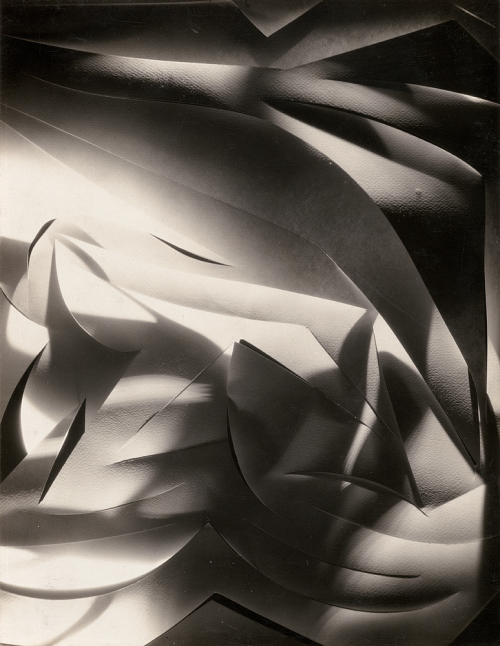
Strand 2 - Francis Bruguiére
Bruguiére is an American photographer who's interest is in texture and abstraction. He does this by twisting cut out paper which is then lit by a single lamp placed in different positions. He also photographs using a film camera. Perhaps Bruguiére wants us as the viewer to consider the simplicity of the piece and the intricate cuts of each image.
|

|

|
Contact Sheet


I chose to respond to Francis Bruguiére's work because of the simplicity and yet detail of his work. It seems like two dimensions in one that epitomises the definition "abstract". For my response, I used scalpel and cut several curves and lines onto the paper and then experimented with creating different 3D shapes. I used an orange soft light aswell as my phone flashlight which created several shadows and individual images of their own. Then in the phone app, I altered between the camera filters "mono", "silvertone" and "noir", to create the same tones Bruguiére had. I also played with the bold point, shadow, highlights, brilliance, and also sometimes exposure, vibrance and saturation. I used both black and white backgrounds and at times used certain colour gels.
Final Edits
Strand 3 - Grant Simon Rogers
|
|
|
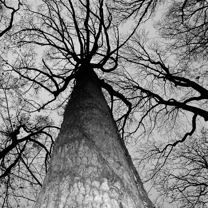
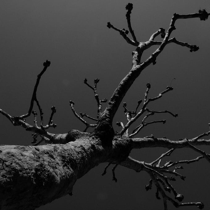
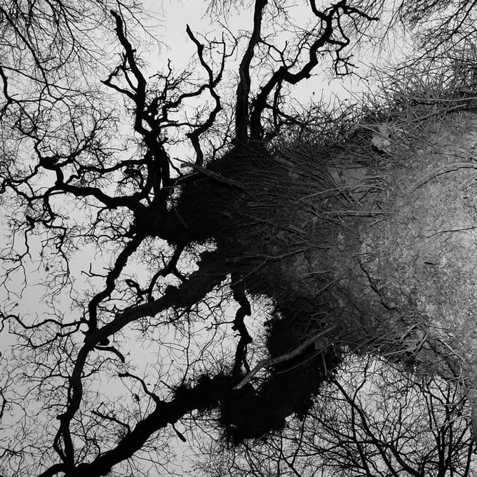
For this first part of the project I was inspired by the work of Grant Simon Rogers, and his composition of the the trees, as they are almost towering over the camera. The trees towering over the camera also creates a contrast between the positive and negative space, and the way the tree is structured allows the image to be dynamic and not boring. However, the negative space allows the viewer to take a breath from the positive space which would have otherwise been overwhelming.
To recreate these images, I went around Muswell hill and looked for trees with a large width then i took the images from underneath the trees, so the trees would be towering over me. (I may also visit some parks to take pictures of trees that have a larger width but that have less leaves as the selection of trees Rogers chose are more sparse.)
Contact sheet


Colour Edits
Noticeably in Rogers other botanical images, the images are taken at a very low exposure which allows the colour from the plants to pierce through the image. In this, when editing I found that there was a nice contrast between the brown and black leaves for example on low exposure and decided to edit in the style of Roger before turning my images black and white.

|

|

|
Final Edits

|

|

|
Development 1 - Isolated structure - Roxanne Worthington
Roxanne Worthington reveals the delicate side of flowers by pressing them in glass and projecting them directly onto photographic paper. In a blog Worthington, is fascinated by the flowers saying how if you look closely you can see plant juices ooze out of the flower as it is crushed between the pieces of glass. As if the still life images of flowers arrange themselves in beautiful patterns to be captured by the photographer’s lens. Worthington's ideas are supported by her technique which follows as : creating photograms, by placing photographic paper and the flower directly under the enlarger light. The image is then captured on photographic paper. This method allows the flowers to look soft and feathered like a painting. Roxane Worthington wants us to see the beauty in everyday simplicity, a café chair, a pair of feet or whatever. or whatever.

|

|

|
Photogram -
A photogram is a photographic image made without a camera by placing objects directly onto the surface of a light-sensitive material such as photographic paper and then exposing it to light.
A photogram is a photographic image made without a camera by placing objects directly onto the surface of a light-sensitive material such as photographic paper and then exposing it to light.
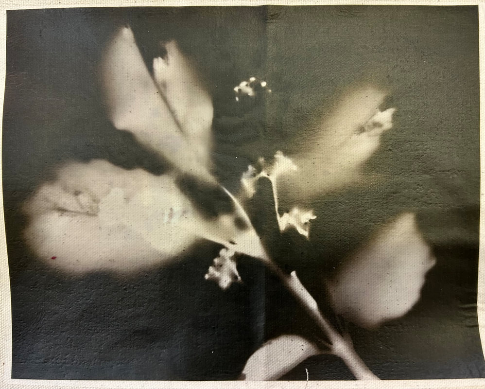
I chose this as the second strand as it shows the naked structure of the plant and almost unveils what was hidden in Davidoff's images. In the first image, I like how the photogram shows us the fine details of the structure and still has the contrast between the thicker white stem and the small fine details. Even in the last image, the structure is hidden in the body of the larger leaves, and its structure is highlighted in the photogram.
Contact sheet - from the darkroom -univerted


In the making of the second image, it was a more refined process once I knew what to do, as I wanted the background to be as black as possible without the stems of the leaves turning black as they were quite a thin. To achieve this I put the enlarger light as high as it could be so that there would be less light exposure on the stem but enough so the surrounding background that had no barrier would go black quickly. Then I put the timer on 4s and then I covered the main stem area of the plant with my hand . The last 1 second I removed my hand so the middle area of the flower could be exposed to the light for a short amount of time.
Then I developed it for quite a long period of time as there the middle section was a different shade to the background so I waited for the middle to turn very black so I could edit it all later properly. Then I took the image through the fix and stop process then the water bath and drying process. After this I edited the image to have a 'noir' filter so it was as black as possible then I put the contrast up to really accentuate the contrast between the white and the black.
The third image was actually a test strip however I liked the way some parts where developed and others where white, it allowed the image to be dynamic and interesting.
Final Edits

|

|

|
In conclusion, I like how the first and third image isn't so refined due to the soft edges and this was achieved by leaving my image in the developer to the point where the developer started to "erode" the actual flower. So I repeated this method again using a different flower as I wanted to have three images printed on fabric in order to experiment with them.

Development 2
Silent Beauties - Leendert Blok
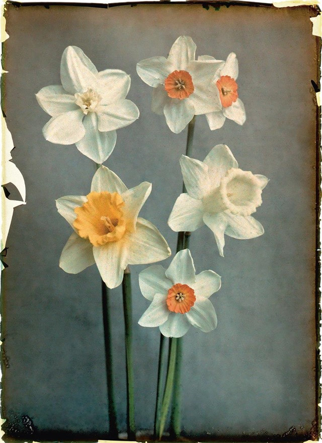
Working closely with the growers, botanist photographer Blok began to document the blooms of flowers in intricate detail for study purposes. By capturing his subjects against plain, neutral backgrounds and lighting every blossom with precision, he was able to capture the subtlest nuances of texture, colour and form. Blok may want the audience to analyse each blossom and how individual and unique they are. Especially as the flowers are at different stages of blossoming.

|
|

|
Final Edits

|

|
|
Experimentation
I used oil pastels to roughly colour the petals of the flowers. Then I rubbed the fabric together which smugged the colours together. After that I ran the fabric under water and when there was less water on the fabric I spread sugar on the coloured areas and pressed the sugar down so it would hold onto the fabric. I love how the sugar make the images perhaps sparkle and it also just adds another level of texture.
I used oil pastels to roughly colour the petals of the flowers. Then I rubbed the fabric together which smugged the colours together. After that I ran the fabric under water and when there was less water on the fabric I spread sugar on the coloured areas and pressed the sugar down so it would hold onto the fabric. I love how the sugar make the images perhaps sparkle and it also just adds another level of texture.

|

|

|
