Abstract Form
An abstract photograph draws away from that which is realistic or literal. It draws away from natural appearances and recognisable subjects in the actual world. Some people even say it departs from true meaning, existence, and reality itself. It stands apart from the concrete whole with its purpose instead depending on conceptual meaning and intrinsic form.
- John Suler
- John Suler
Introductory DSLR exercise
DSLR stands for Digital Single Reflex Camera, in which the camera has more flexibility to have multiple lenses. The most important dials are the mode dial and main dial. The mode dial allows you to switch between different settings for example, portrait to video. The main dial is used to control the shutter speed, i.e how long light is let in for. This allows images to be very flexible in that there can be motion images, still images etc.

To achieve the correct exposure i.e a high quality image, there are three elements that work together simultaneously. This is shutter speed, aperture and ISO as seen in the exposure triangle below.

ISO - Firstly ISO stands for International organisation of standardisation. Essentially, ISO measures the sensitivity of the image sensor in your camera ( an element in the camera that collects light to create an image) and reacts to the x amount of light. This means that a low ISO will be a dim light and therefore a darker image. But a higher ISO means the image will be lighter, this however doesn't mean the image will be 'clearer' , because the higher the ISO the higher the noise as seen in the exposure triangle. (Noise being a grain effect etc). ISO ranges from 100-6400 and can go even beyond that depending on the type of camera.
Shutter speed - When you press the shutter release button you open the shutter to let light in. The time light is being let it in is called 'shutter speed', a fast shutter speed means less light will be let in because the shutter is open for a shorter time. A slow shutter speed means more light will be let in because the shutter speed is open for longer, which is appropriate for very sunny landscapes so that the picture is not over exposed. Also a slow shutter speed will blur movement whereas a fast shutter speed will freeze movement. This allows for images to have blurs and movement especially on the setting BULB. For some shutter speeds you need to check if your camera can 'manage' it, because the three elements all work together at specific settings therefore you also have to adjust the ISO and aperture . This introduces TV (or shutter priority) which stands for time value is a semi automatic mode on the camera allowing you to choose the shutter speed you want that your camera can manage by automatically matching it with an appropriate aperture.
Aperture - Aperture refers to the opening of the lens through which light passes through, depending on how open the aperture is the lens can be completely open ( a wide hole) or just a small circle letting in a limited amount of light. F/stop is what apertures are measured in and a lower f stop
(f/1.4 ) means the aperture is wider and therefore more light can enter the lens. But a higher F/stop (f/22) means there is a smaller aperture and therefore a less light passes through. Depth of field is also controlled by the aperture. Depth refers to how much of the images is in focus and therefore sharper compared to the rest of the image which is softer. A shallow depth of field, requires a wide aperture ( wider hole), where the sharpness on the whole image is limited to perhaps the images the camera is focusing on. However, with a wide depth of field the aperture is smaller and resultantly there will be a higher focus on the image as a whole. Aperture priority is also used under the setting AV in the mode dial, so that the camera can match an appropriate shutter speed the camera can manage to the aperture that has been chosen.
Task 1
In the first task, we had to shoot falling confetti behind with a white backdrop and a tripod. We experimented using different shutter speeds to see what would happen (bury/freeze images etc), we also had to consider what would happen when we experimented with shutter priority. At a certain point the information on the camera began to flash, indicating that the camera couldn't manage the shutter speed that was selected. This meant I had to adjust the ISO and the aperture so all three elements could work together properly.
Contact Sheet


|


|
|


Below are two examples of a fast shutter speed where the confetti is clearly captured in the image as a freeze frame, and then a slow shutter speed where there the movement of the confetti is captured.
|
Fast Shutter Speed = freeze frame
|
Slow shutter speed = movement / blur
|


Task 2
For task 2, we were exploring aperture, in other words depth of field. We scrunched up three coloured sheets of paper and placed them in diagonal view of each other and then I first focused on the first piece of paper (the blue), which meant there would be a shallow depth of field so the background would be blurred. For this image i used an F-stop of 36 i.e a wide aperture, with an ISO of 400 which my camera could manage; this image can be seen below. Then I experimented using a wide depth of field, i.e smaller aperture of 5.6, in conjunction with a shutter speed of 1/25 and ISO of 400 which my camera could manage. This resulted in the image being generally clear but not as focused as it would be on one image.
Contact Sheet


Below are the chosen images for a wide aperture and small aperture along with the settings I used.


WWW: You can clearly distinguish and recognise a slow and fast shutter speed aswell as wide and shallow aperture from the final images
EBI: For my aperture images I could have had a clearer fully white background
EBI: For my aperture images I could have had a clearer fully white background
The White Paper Test - task 1
The introductory task was to shoot one piece of white paper, manipulating the shape (crumpling, folding etc ) or angles the image was taken in, without ripping, or cutting the paper etc . Generally, on a white background in the studio we used spotlights and soft light aswell as gels to change the colour of the lighting. However, I found that the colour gels used to filter the lighting wasn't coming through as i would have wanted, so I turned off the main light and altered the different lights on the studio bulb. I also used my iPhone flash to create additional shadows. For my chosen edits, I used the black point, definition and sharpness tool to enhance any shadows created or creases in the picture etc.
Contact sheet


Chosen Edits
WWW: I experimented using different gels and shapes
EBI : I would make sure all the images were of high quality and all on a white background to draw more attention to the image
EBI : I would make sure all the images were of high quality and all on a white background to draw more attention to the image
Abstract Development - task 2
In this task, we had to choose two out of 4 abstract artists to respond to. I chose to respond to the artists Francis Bruguiére and Brendan Austin who both work with shapes, lighting and texture.
Francis Bruguiére
Bruguiére is an American photographer who's interest in texture and abstraction sparked in 1912, leading to his experimentation in 1928 as a non-representational photographer in London. His work in paper abstraction is particularly interesting because of the simplicity and yet complex shapes created by the cuts and lighting.In 1930, he and Oswell Blakeston produced England's first abstract film, light rhythms, based on a series of Bruguiére's light abstractions . His early showcases of the work dates back to his time in Berlin, Germany in the "Der Strum" gallery.


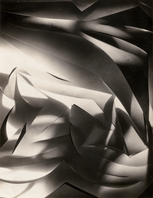
My Response
I chose to respond to Francis Bruguiére's work because of the simplicity and yet detail of his work. It seems like two dimensions in one that epitomises the definition "abstract". For my response, I used scalpel and cut several curves and lines onto the paper and then experimented with creating different 3D shapes. I used an orange soft light aswell as my phone flashlight which created several shadows and individual images of their own. Then in the phone app, I altered between the camera filters "mono", "silvertone" and "noir", to create the same tones Bruguiére had. I also played with the bold point, shadow, highlights, brilliance, and also sometimes exposure, vibrance and saturation. I used both black and white backgrounds and at times used certain colour gels.
I chose to respond to Francis Bruguiére's work because of the simplicity and yet detail of his work. It seems like two dimensions in one that epitomises the definition "abstract". For my response, I used scalpel and cut several curves and lines onto the paper and then experimented with creating different 3D shapes. I used an orange soft light aswell as my phone flashlight which created several shadows and individual images of their own. Then in the phone app, I altered between the camera filters "mono", "silvertone" and "noir", to create the same tones Bruguiére had. I also played with the bold point, shadow, highlights, brilliance, and also sometimes exposure, vibrance and saturation. I used both black and white backgrounds and at times used certain colour gels.
Contact Sheet


Edited Images
As mentioned previously, I used several tools such as, exposure, brilliance, highlights, bold point and shadow etc. I also included the 3 colour images i edited at the beginning as a development from the tradition Bruguiére pieces. In this gallery I wanted to showcase all the images I believed had potential and depicted the style of Bruguiére.


Final Chosen Edits
After the gallery, I decided to narrow the images down to 7 images i thought were different yet resembled the work of Bruguiére
WWW: I successfully experimented with light and shadow, and depicted the style of Bruguiére
EBI: I would try to experiment with a larger variation of shapes to avoid repetition
EBI: I would try to experiment with a larger variation of shapes to avoid repetition
Brenden Austin
Brendan Austin, an American photographer born in New Zealand began working as an architectural and landscape photographer living and travelling to several countries such as South Africa, Singapore etc . One of Austins pieces that stood out to me was the "Paper mountains" published in the Gallery Joans Kleerup in Stockholm of 2012. Brendan Austin explored what we mean by nature and the way humans have impacted upon it. He also used his resulting images to depict how a real image of a mountain or a crumpled up piece of paper imitating the structure of a mountain are equally as recognisable landscapes despite the artifice.


Contact sheet


Edits
I used a mixture of tissue paper and foils, and then edited them by increasing the definition and sharpness to bring out the texture. I left some images with a slight tint because i noticed in Austin's images he sometimes has brown tints or ombre tints on his images, perhaps to resemble a mountains nature even deeper. I also increased the highlights so that everywhere the light was on the image would be highlighted, further increasing the texture.


Final Chosen edits
WWW: I captured the texture and highlights, which are shown in Austin's work
EBI: Next time I would like to experimented with watercolour, to create the ombre effect on the white mountain structures.
EBI: Next time I would like to experimented with watercolour, to create the ombre effect on the white mountain structures.
Ordinary to Extraordinary
Edward Weston

Task 1
info file
info file


Task 2
xxxxxx
xxxxxx
Contact sheet for natural light


Chosen edits
xxxxx
why
how
editing style
my goal in editing :what i wanted to stand out ......
why
how
editing style
my goal in editing :what i wanted to stand out ......
WWW:
WBI:
WBI:
Task 3
xxxxx
contact sheet for artificial colour


Chosen edits for artificial colour
WWW:
EBI:
EBI:
aBSTRACT comparison - body and nature
Alicja Brodawix......
xxxxx


Task 1
xxxxxx
xxxxxx
Contact Sheet


Human another contact sheet


Final edits (needs one more)

|

|


|
WWW:
EBI:
EBI:
Bill Jacboson
who?
intentions?
technique
intentions?
technique


Task
xxxxxxxx
contact sheet


Chosen images
Task 1B - Bill Jacobson colour images
contact sheet


Chosen images
WWW:
EBI:
EBI:
Experimentation with Bill Jacboson
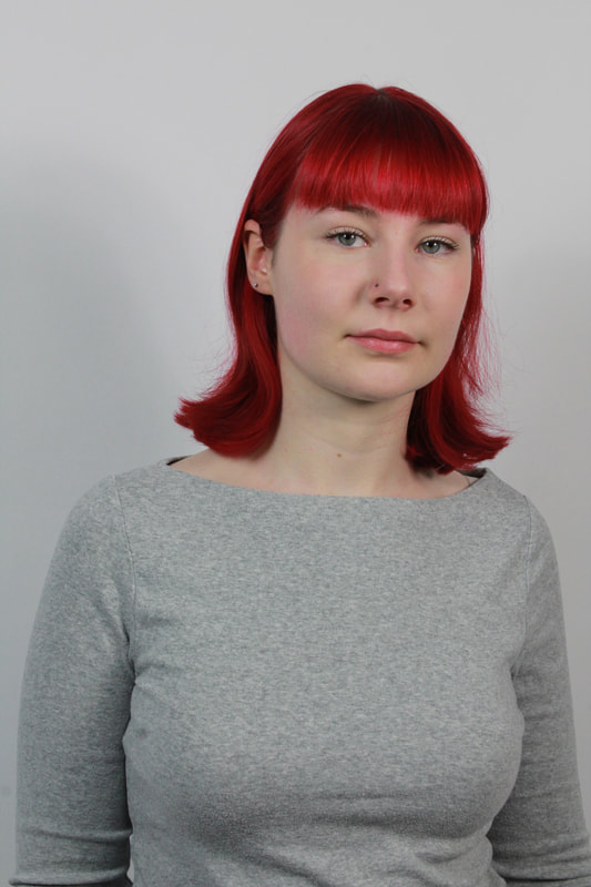
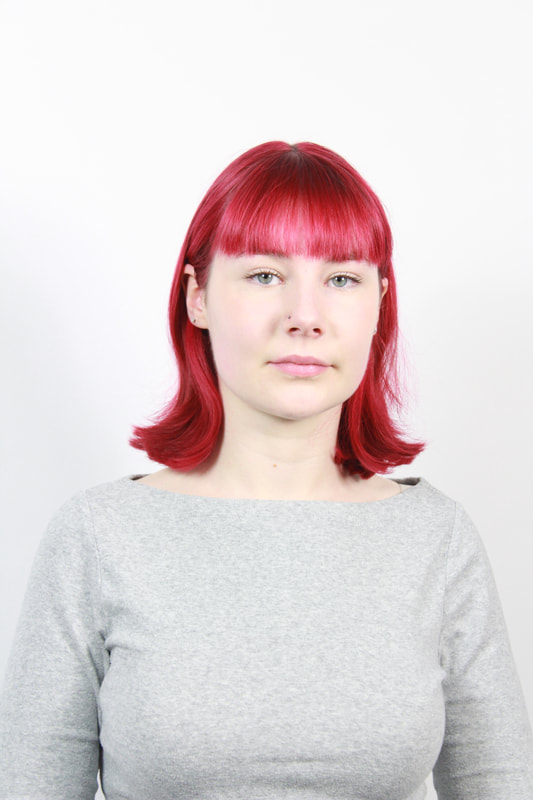
I noticed that in our initial classwork we used tracing paper to mimic the distorted style in Jacobson's but I also noticed that in Jacobson's images he had a bleached blurry effect. Upon reflection, I attempted to recreate his work as a development from my previous work. For this work, I used a white backdrop, with 2 bright studio lights and I revisited the technique briefly used in the previous task called bracketing to bleach the image. This technique not only allowed me to replicate the bleach white image Jacobson produces, but also it strongly contrasted with the subjects red hair. Then I blurred my lenses and took several images. I also took bleached images without the blur, so i could experiment on photoshop with tools i has discovered.
In photoshop, I used the x tool to smooth out the images (feather?) then I used the gaussiun blur filter on the setting x(a number)
In photoshop, I used the x tool to smooth out the images (feather?) then I used the gaussiun blur filter on the setting x(a number)
contact sheet


|
Without bracketing
|
With bracketing
|
|
|
Final images in colour and edited
In photoshop I grayscaled by images and then i used a feather brush in white to soften and make her hair colour lighter. I also went over the background slightly and her top to make them more neutral and less loud.
|
|
|
WWW:
EBI:
EBI:
Erwin blumfield
xxxxxxxxx
who?
context?
intentions?
technique?
who?
context?
intentions?
technique?


Chosen images
Development -moving erwin blumfield images and taking pictures in fragmented images
WWW:
EBI:
EBI:
Ambiguity
Johnny Kurr
Context, intentions, techniques


Matthieu Venot
Xxxx
context, intentions, technique
context, intentions, technique


Task 1
In this task I had to take pictures around the school of colourful scenery with different unique shapes, crevasses, curves etc xxxxxxxx.
contact sheet in school and outside


Upon reflection, I realised both artists has access to a wider variation of colour architecture so after school I decided to research places in London that resembled the scenery Venot and Kerr shot. Resultantly I went to Kelly street in Kentish Town and around the Camden area, it was also very helpful that the sky was mostly blue at that hour, this gave me much more creative freedom and colour range. In the slide show below there is a chosen selection of places in school aswell as in Kelly street.
Chosen
|
chosen slideshow from school (in and around buildings)
|
Chosen slide show from Kelly street
|
|
|
|
Task 2 - editing
xxxxxxx
editing tools....
process for editing - google slide
Whilst editing I noticed that although the overall objective was to simplify the images, Kurr and Venots images also kept texture, shadow, depth and dimension which allowed the images to still be realistic to a certain degree. Even small details like the windows being kept the same or the walls still having their texture made huge subtle but impactful differences to the image . Due to this when editing i decided to experiment by simplifying my images completely at times but then going back to leave some elements in my photos unedited or barely simplified. This can be seen in how some windows were edited and or left the same or how some bricks in the building was edited to just make one solid colour and or I edited the bricks to be simplified by still keeping the texture and structure of bricks . and still had dimensions of depth, shadow, texture etc.…..
editing, editing tools etc
Editing slideshow xxxxxx
Reflection comparisons
xxxxxxxxxx
an example for in school
|
inside of window unedited, sky unedited (kentish town edit )

|
windows and sky simplified
kenitsh town edit 
|
no window, block colours, still small details (kentish town edit)

|
|
bricks kept in but edges smoothed out
kentish town edit 
|
bricks taken out, flat one colour but still details (Kentish town edit )

|
slide show of school edits and outside edits with their normal colours
Task 2b

articial editing.....
reflection
colour wheel
harmonious colour, opossing etc explanation
colour wheel below
reflection
colour wheel
harmonious colour, opossing etc explanation
colour wheel below
slideshow/screen grab work below
then final images of inside school and outside school
reflection xxxxxx
Abstracting the environment
Task
In this task we were required to take a series of photographs in the style of Lee Friedlander, Saul Leiter and Stephen Calcutt. We could use our local areas and the city as a means of creating abstract portraits by shooting portraits through doors, car windows, shop windows, scuffed up phone boxes etc.
In this task we were required to take a series of photographs in the style of Lee Friedlander, Saul Leiter and Stephen Calcutt. We could use our local areas and the city as a means of creating abstract portraits by shooting portraits through doors, car windows, shop windows, scuffed up phone boxes etc.
Contact sheet


Lee Friedlander
Lee Friedlander is an American photographer who follows the traditional documentary style of photography as practised by earlier pivotal photographers; Walker Evans Robert Frank. His popular mannequin series was curated across Los Angelos, New York and San Fransisco for 3 years until completion, and for this body of work Friedlander returned to the hand held 35mm camera used in his earlier days; focusing on consumerism, fashion etc.
Lee Friedlander is an American photographer who follows the traditional documentary style of photography as practised by earlier pivotal photographers; Walker Evans Robert Frank. His popular mannequin series was curated across Los Angelos, New York and San Fransisco for 3 years until completion, and for this body of work Friedlander returned to the hand held 35mm camera used in his earlier days; focusing on consumerism, fashion etc.


My response


Saul Lieter
Saul Leiter an American photography who in the 1940's documented street life in black and white using obstruction, blurred movement etc. He is also a pioneer of colour photography, developing his work with the use of a vibrant palette
Saul Leiter an American photography who in the 1940's documented street life in black and white using obstruction, blurred movement etc. He is also a pioneer of colour photography, developing his work with the use of a vibrant palette


My response


Stephen Calcutt
xxxxxxxx
xxxxxxxx


My response


WWW:
EBI:
EBI:
Chemigrams Pierre Cordier


On November 10th 1956 Pierre Cordier, a belgian artist, discovered the chemigram process. Contextually, during his military service in Germany of that year Cordier wrote out a dedication to a young German girl, Erika, writing with nail polish on light sensitive paper. He was always interested in writing, painting and photography but the chemigram combines the processes of painting, photography and science without even using a camera. Since then he has since been named the pioneer of chemigrams.
Cordier discovered that a resist can hold back the chemical effects of developer and fixer on black and white photo paper for a time, a resist referring to any barrier like substance such as oil, butter, cream etc. With this being said if you put exposed paper into developer the paper will turn black expect for the section where you have put the resister. This is the same with fix expect the paper will turn white expect for the sections with resistant on. This is with the exception of colours such as pink, gold etc coming in throughout the process.
Cordier once said "I encourage the accidents of material, and I improve as the creation goes along. We can compare it, in the same way, to classical musical and jazz", with this being said with the discovery of the chemigram method he began experimenting with these materials. Noticeably, due to the resistant substances it stopped the chemicals from absorbing creating several different shapes, that are quite fine and distinctive in structure.
Task
|
In this task, we has to imitate the style of Cordier. We has a fix, developer and stop bath to use interchangeably and there was no set rules we just had to be aware of what each action would result in. This fit very coherently with the personality of Cordier. We also had the set up in the light as a dark environment was not needed.
During my experimentation I aimed to make the first(as seen to the right) image a hand, by using honey on my hand and coffee granules. I was inspired by Meghan powells work using butter and coffee and so my expectation was that there I would create a black hand; the addition of coffee for me was more about adding pigment here and there rather than the whole background. However, I realised my method was wrong as i put the soft resistant (honey) on my hand which would theoretically block out the hand or most of it as it appeared. This outcome was still interesting to me because you can still identify the image with finger prints in an abstract way. The coffee residue on the edges also acted like a shadow. |

|
Contact sheet
As i began to practise i started to notice patterns in my work and also captured the developing/fixing process so in some images you can see the affected regions started of pink but then turned yellow, brown and black etc.
As i began to practise i started to notice patterns in my work and also captured the developing/fixing process so in some images you can see the affected regions started of pink but then turned yellow, brown and black etc.


Final images

|
|

|


WWW: I experimented with different soft resists that caused different effects
EBI: Next time I would experiment more with "hard" resists like bottle lids rather than mainly soft resists.
EBI: Next time I would experiment more with "hard" resists like bottle lids rather than mainly soft resists.
Development Project - 2 strands
quick summary of the work: built on the foundation of bill Jacobson, then i turn the images into movement (gifs) then experiment with projections/chemigrams
Initial ideas (how I mapped out my vision originally ) images below
Strand 1 Bill Jacobson and Erwin Blumfield
Fact file on Bill and erwin
Task:
why have I chosen to do it :
How: etc
why have I chosen to do it :
How: etc
Contact sheet


My idea : I started off with taking images on a white background using people with predominantly white clothing. Then, I bracketed my camera, and experimented with shutter speed and ISO depending on the persons shade, in order to further bleach out the image. I mostly used shutter speed and the bracketing setting, keeping my ISO on 200 in order to avoid any noise. Below you can see the different shutter speed and bracketing made, as well as the various settings I used, on the models.

|

|

|

|

|
Editing
Pre-editing tests
I used two editing tools, initally, i first collated all the images but using screen record then scrolling along all my pictures on camera roll. Then I used a black and white filter, and also decreased the saturation and vibrancy levels because some of the models hair showed up very strong on the images, and I noticed in Bill Jacobson image the hair was quite soft and light. This meant I could have a rough idea of the goal I wanted to achieve.
Then in photoshop I begun the real editing, where I used the black and white adjustment and then I experimented with the levels and contrast/brightness.
Upon reflection, I realised it was much smoother and efficient to do most of the work via my phone. So i manually slide the pictures to create a fast pace gif.....
THEN:
I was taught how to do a gif in photoshop which would make the process more seamless since I would be editing on photoshop. To do this I went to file~ scripts~ load files into stacks - browse ~ (then I selected my images) - I went to window and created a timeline - create frame animation.
I was taught how to do a gif in photoshop which would make the process more seamless since I would be editing on photoshop. To do this I went to file~ scripts~ load files into stacks - browse ~ (then I selected my images) - I went to window and created a timeline - create frame animation.
